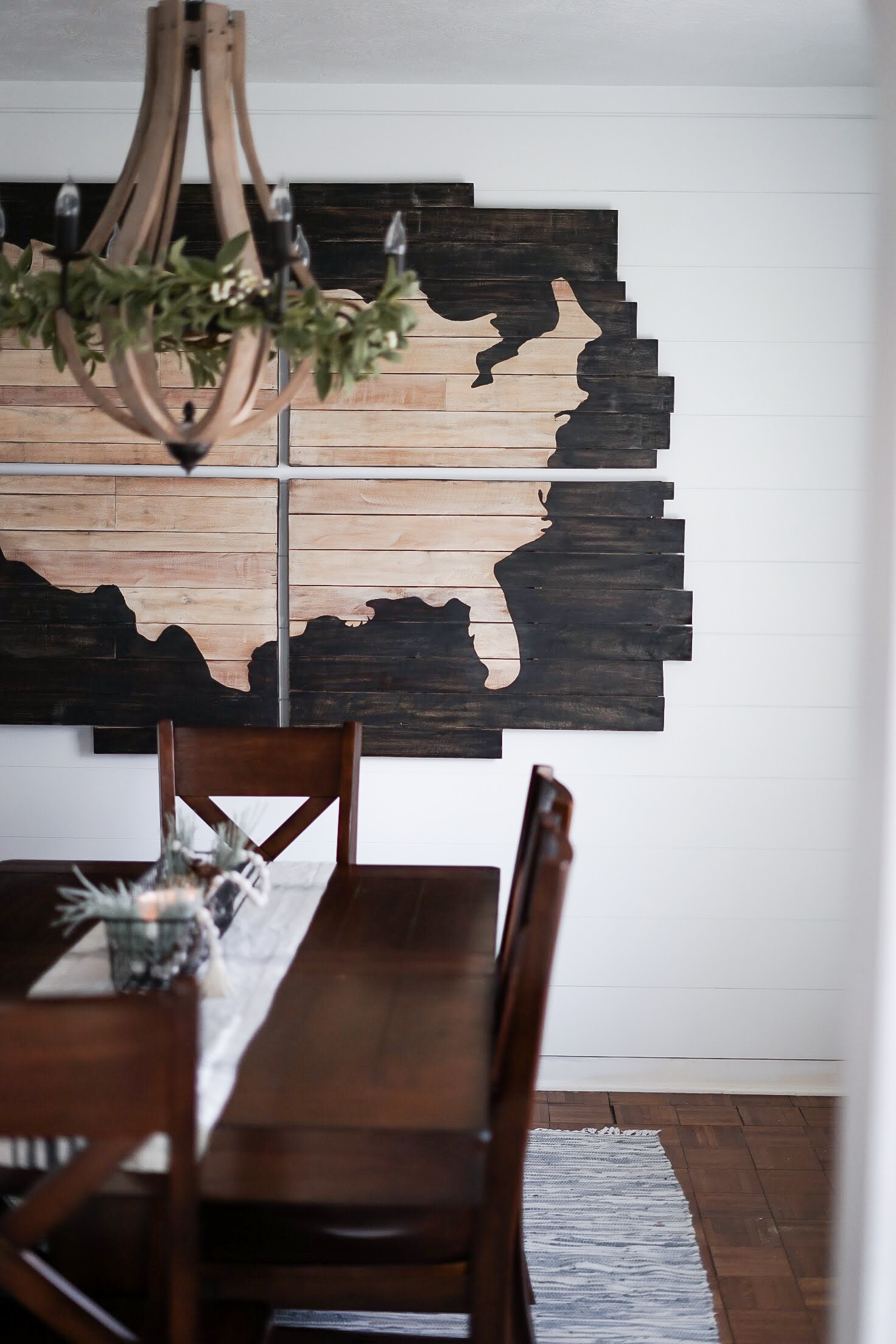
When we purchased this 1931 home about three and a half years ago, we knew it would be a work in progress. Well the progress continues and we love this house more with each modification we make.
If you recall, the dining room underwent a cosmetic update last spring with new lighting, paint and wall decor. However, this was a temporary update knowing we wanted to open up the doorway between the dining area and the kitchen.
We’re so excited to share an update on the larger project that is our main floor! We’ve decided to phase out these renovations to be able to continue living in our house while we work on things… and also in hopes of keeping our sanity 😉 .
Here’s how we’ve decided to tackle the main floor update:
Phase I : widen dining room/kitchen doorway
Phase II: refinish main level hardwood floors
Phase III : update sink/faucet, cabinets, counter tops and add backsplash in the kitchen
Thanks to Wiltch Construction of Sioux Falls, phase I is complete and we couldn’t be happier with the result!
| BEFORE |
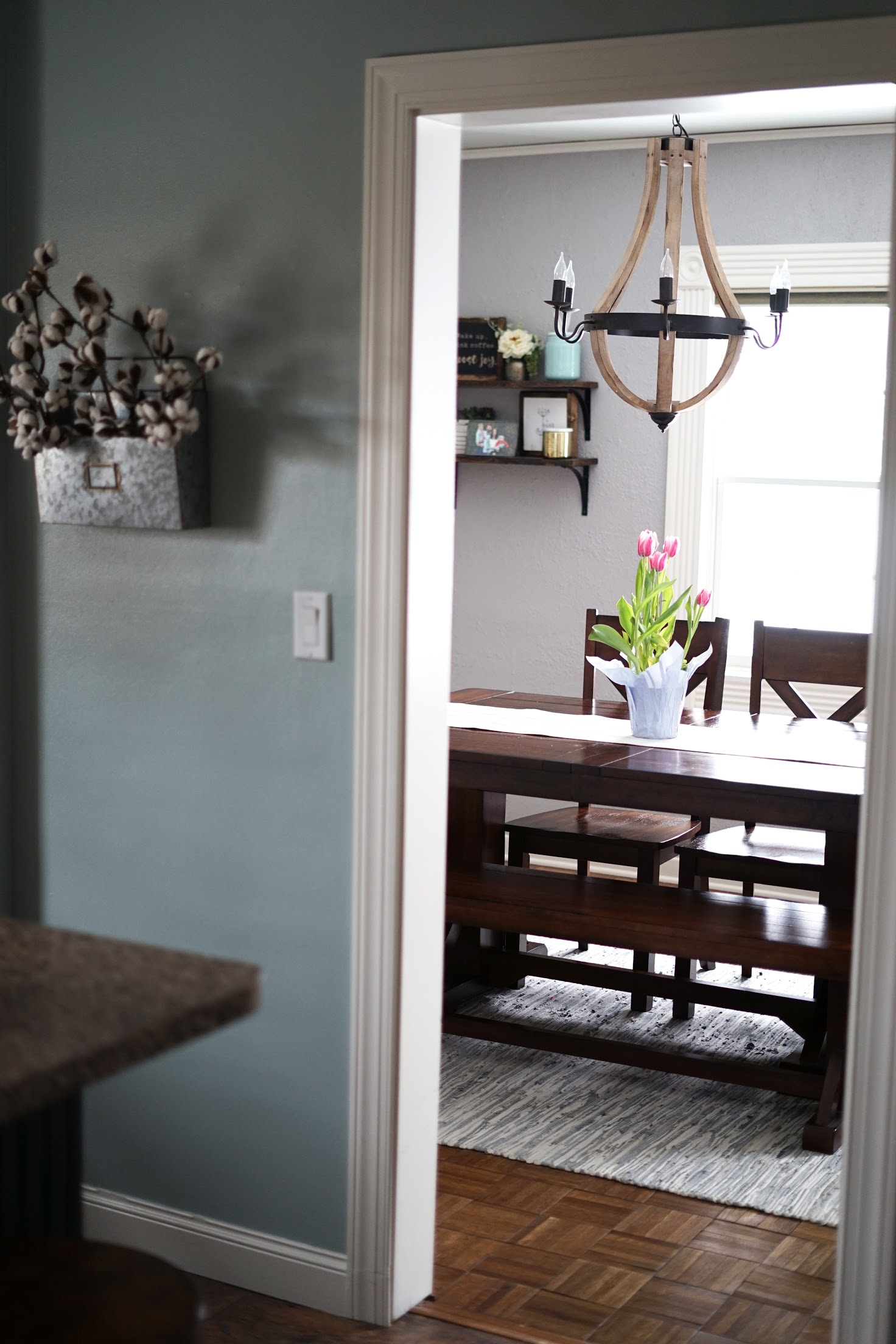
The doorway prior to construction.
The doorway prior to this project was very narrow. It didn’t allow for much light to come into the kitchen and hosting guests was a challenge. The sight-line between the two rooms was very limited and made this entire section of the house feel small.
We weren’t able to take the entire wall out due to plumbing for the upstairs bathroom running down through a section of it. But before construction started, we thought the wall we were opening up was load bearing. We got a pleasant surprise once Erik of Wiltch Construction got started.
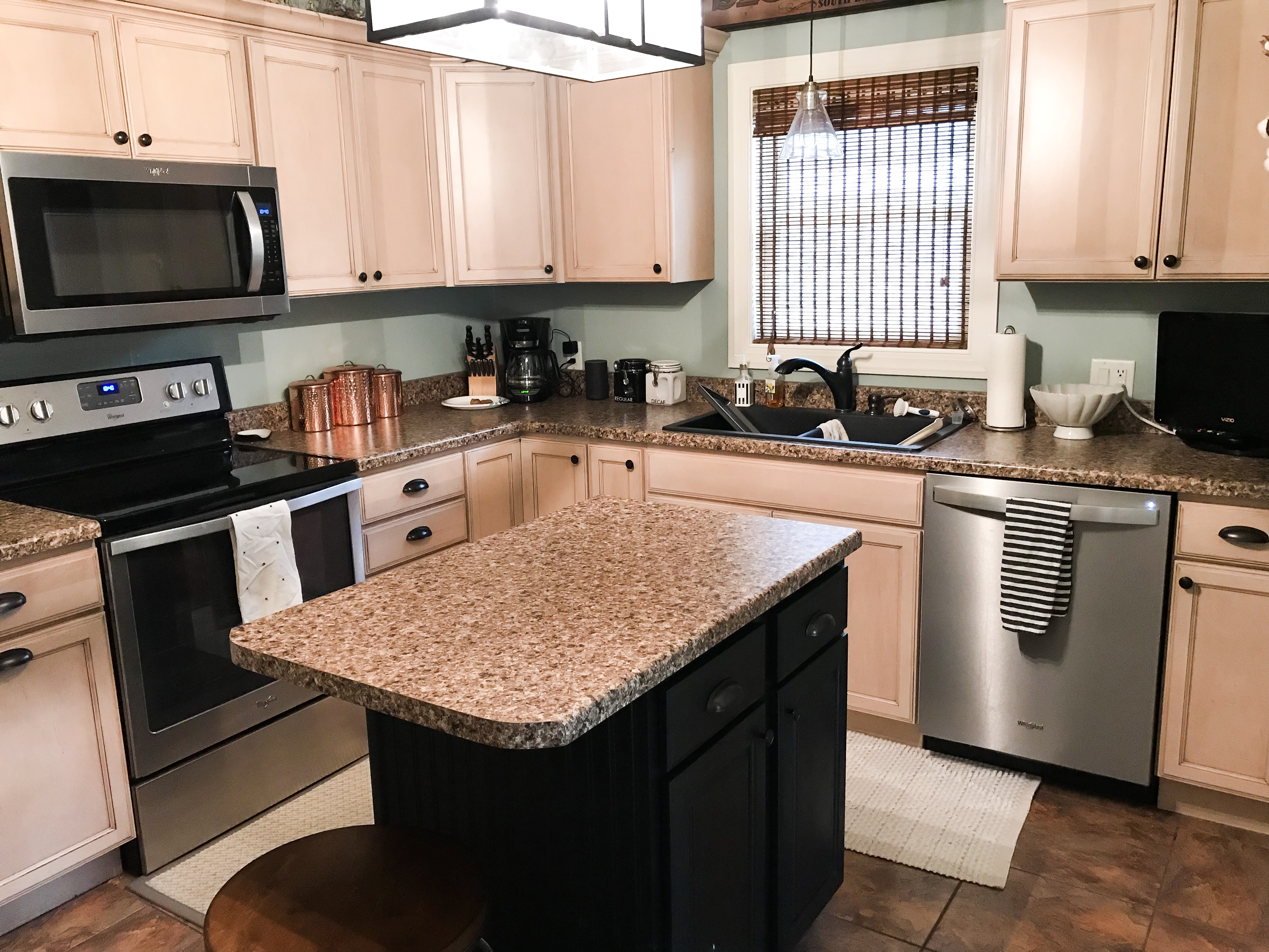
Kitchen prior to construction.
Other than updating the paint on the wall and on the island, and changing out the hardware on the cabinets, the kitchen hasn’t changed much since we’ve moved in.
The island wasn’t ideal for our family {room for only one stool with two children} and while the long-term goal is to update the cabinets throughout the entire kitchen, we were fortunate to find an island that would work better in this space both in the short and long term.
| DURING |
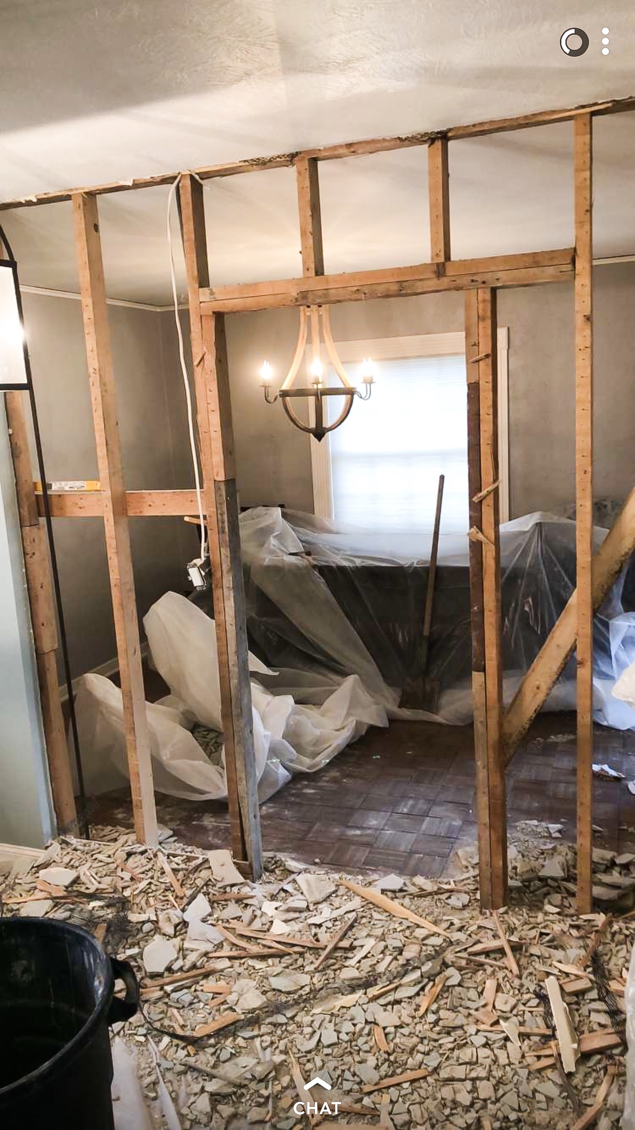
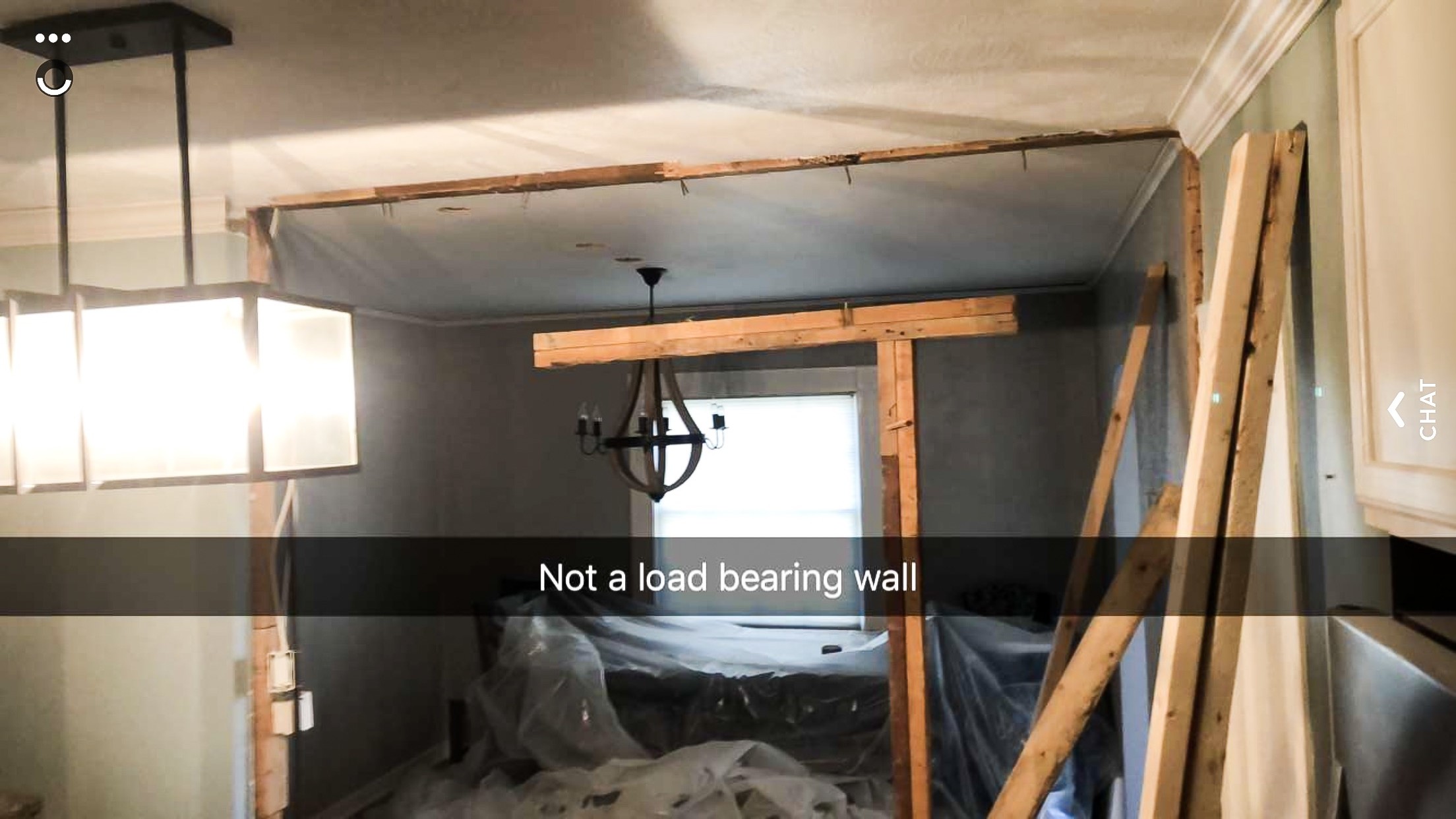
Erik discovered pretty early on within the project that it wasn’t a load bearing wall. {Cue happy dance!} That meant we didn’t need to add a beam to support the opening and it saved a significant amount of money. It also allowed for the opening to be even larger because we didn’t need the beam. All around: great news.
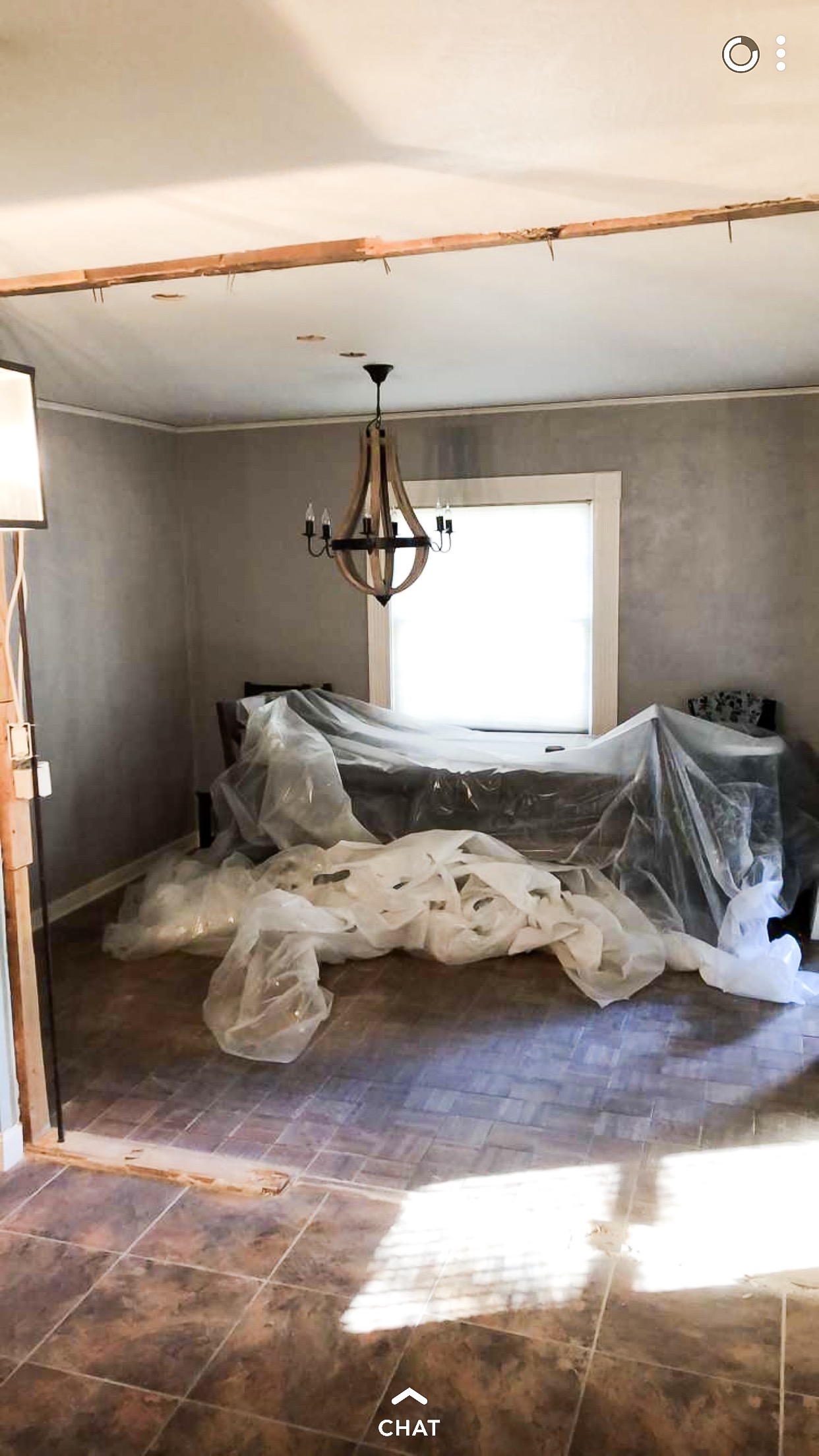
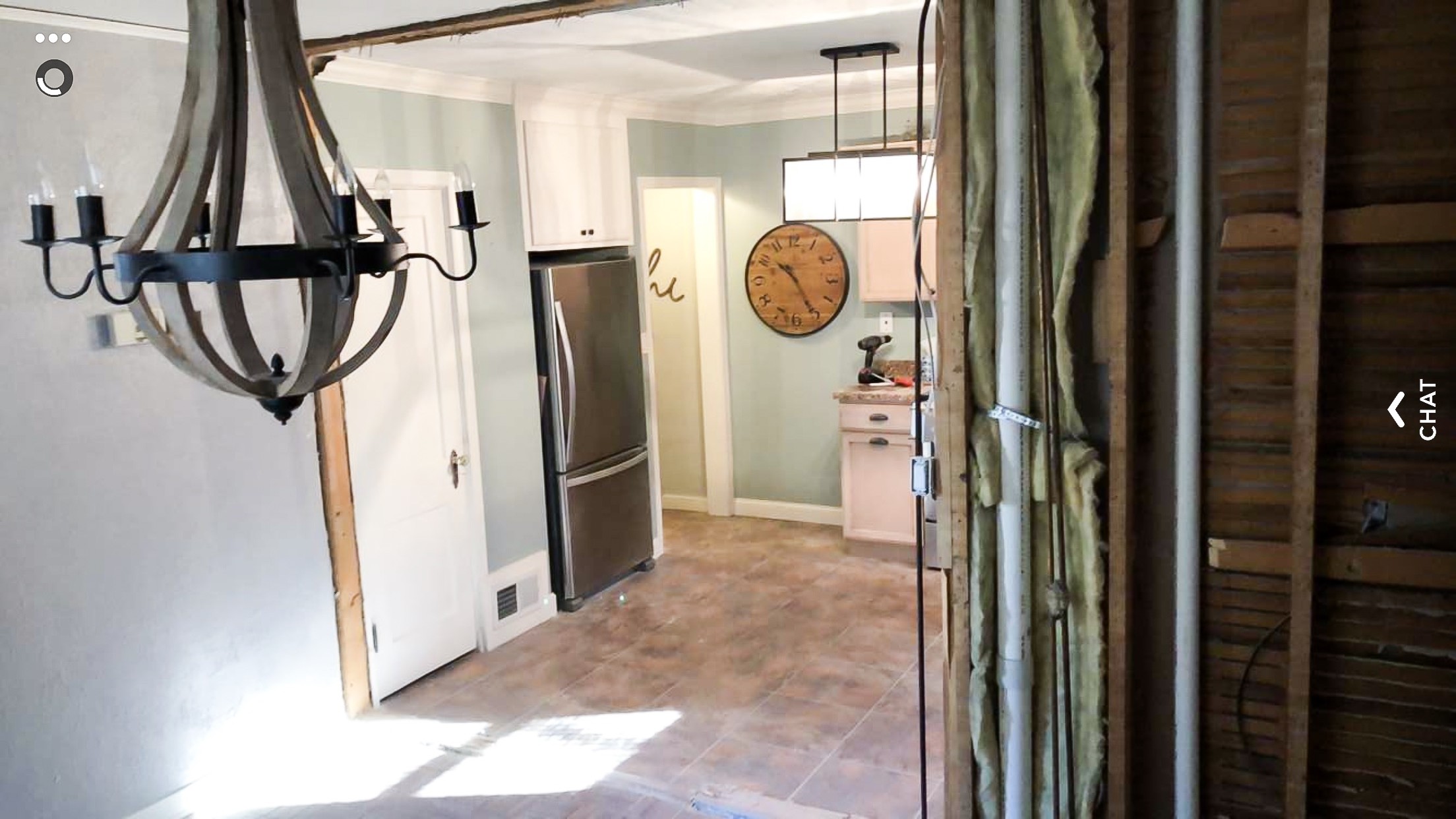
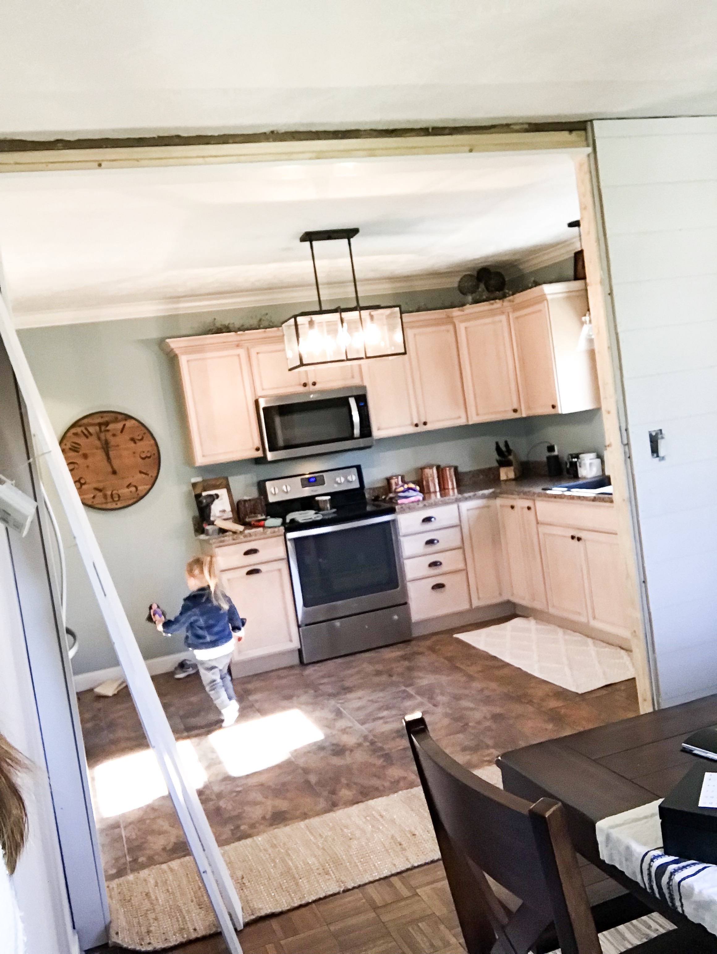
When we moved into this home, the texture on the walls in the dining room was incredibly thick and heavy. While painting the walls to a light grey helped, the room still seemed really outdated because of the texture. We decided to add shiplap to three of the four walls in the dining room to cover the old texture and to add some character.
The fourth wall, which has the doorway into the entryway/front door, was retextured to match the rest of the main floor. We also had the dining room ceiling textured to match what was in the kitchen.
| AFTER |
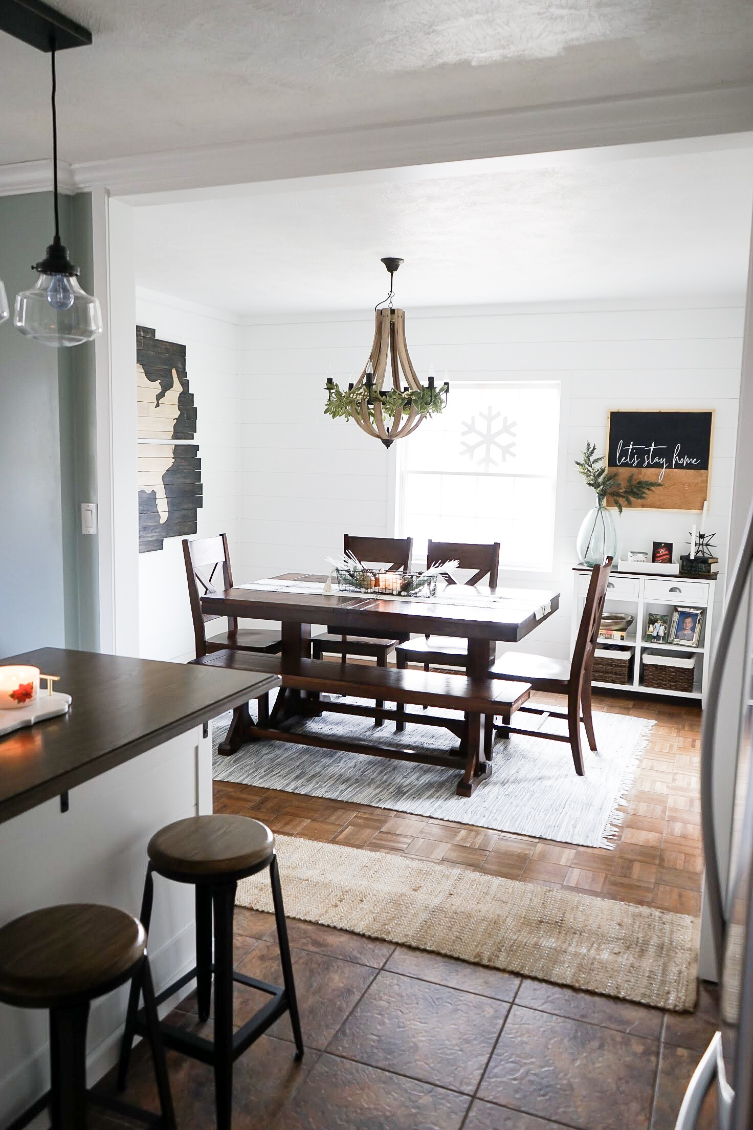
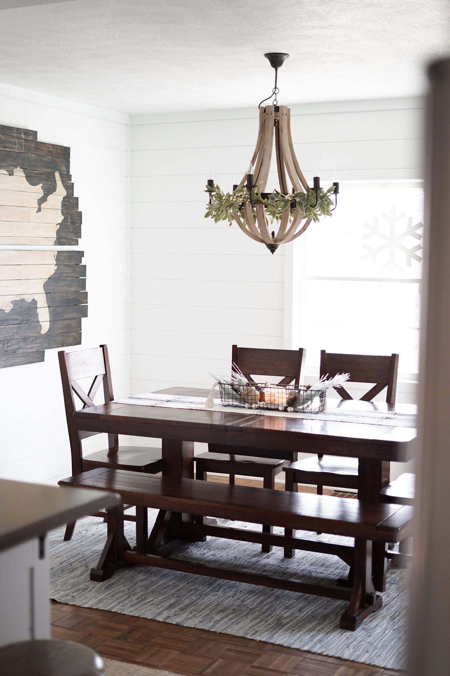
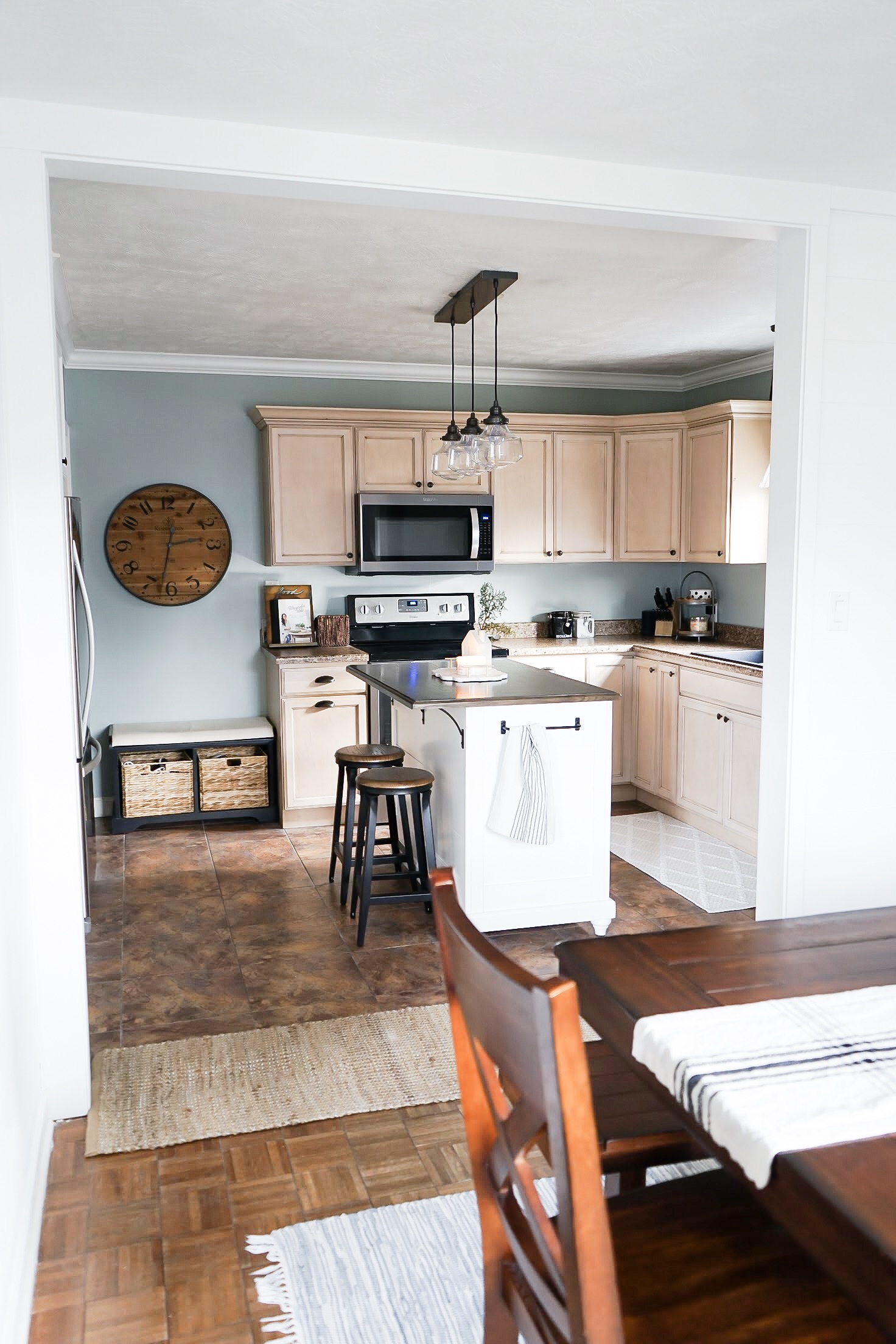
The entire space looks so much bigger and works so much better for our family. It’s also so much easier to host friends and family in this part of the house. With the casing around the opening being so close to the ceiling height, the ceiling also feels so much higher! Hurray for no beam!
The amount of natural light that makes its way from the front window into the kitchen makes the space feel so much brighter!
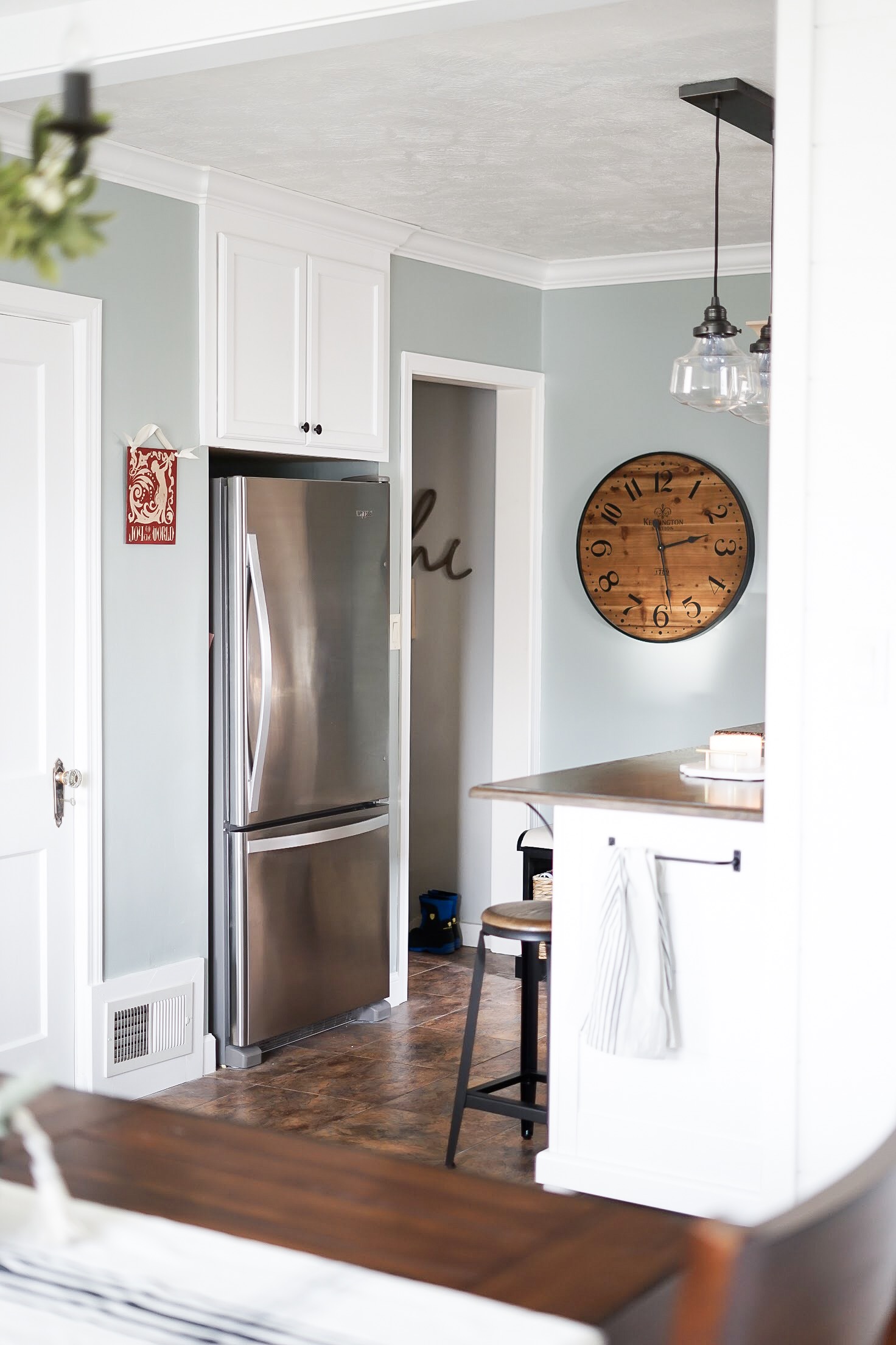
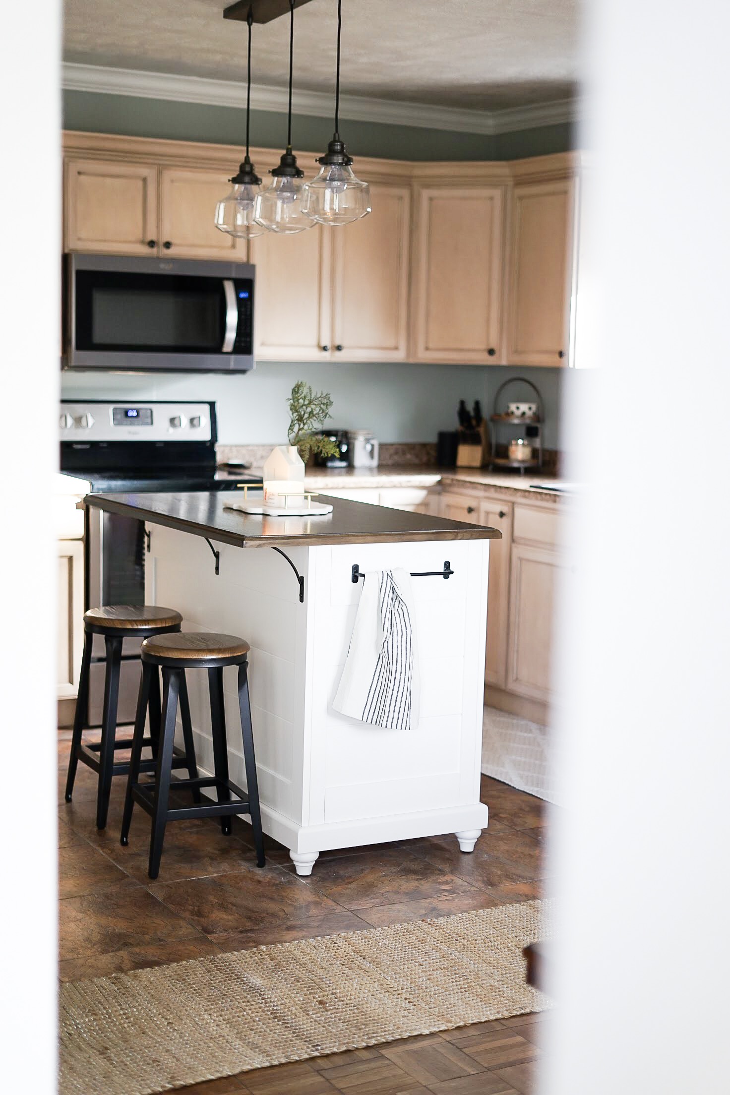
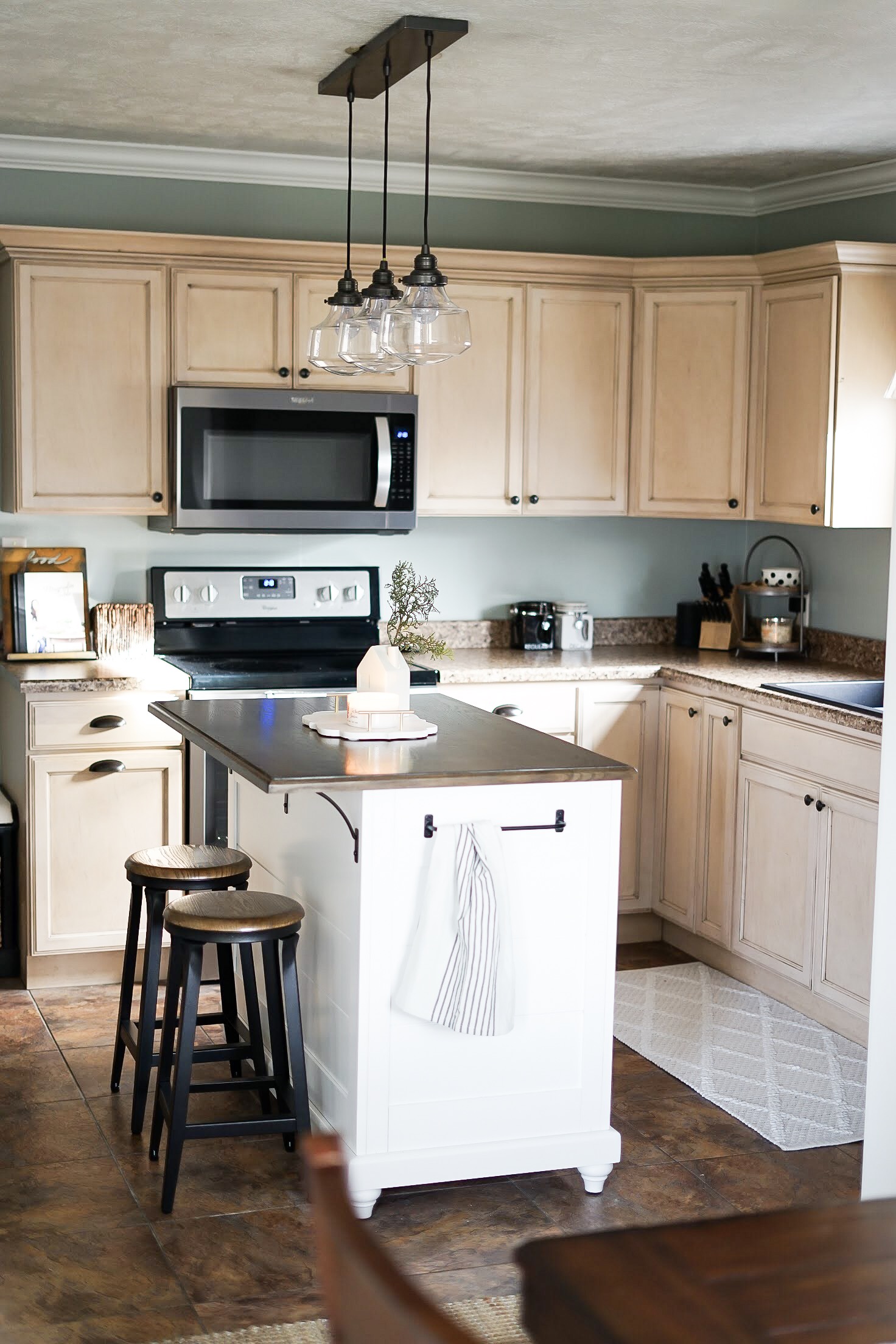
The island we found has enough room for two stools which the kids love. We changed the direction the island runs within the room and it feels so much more natural for the flow of traffic.
We also love the new light fixture! It gives off so much more light than the previous fixture and the style blends the farmhouse and modern styles we’ve blended throughout our home.
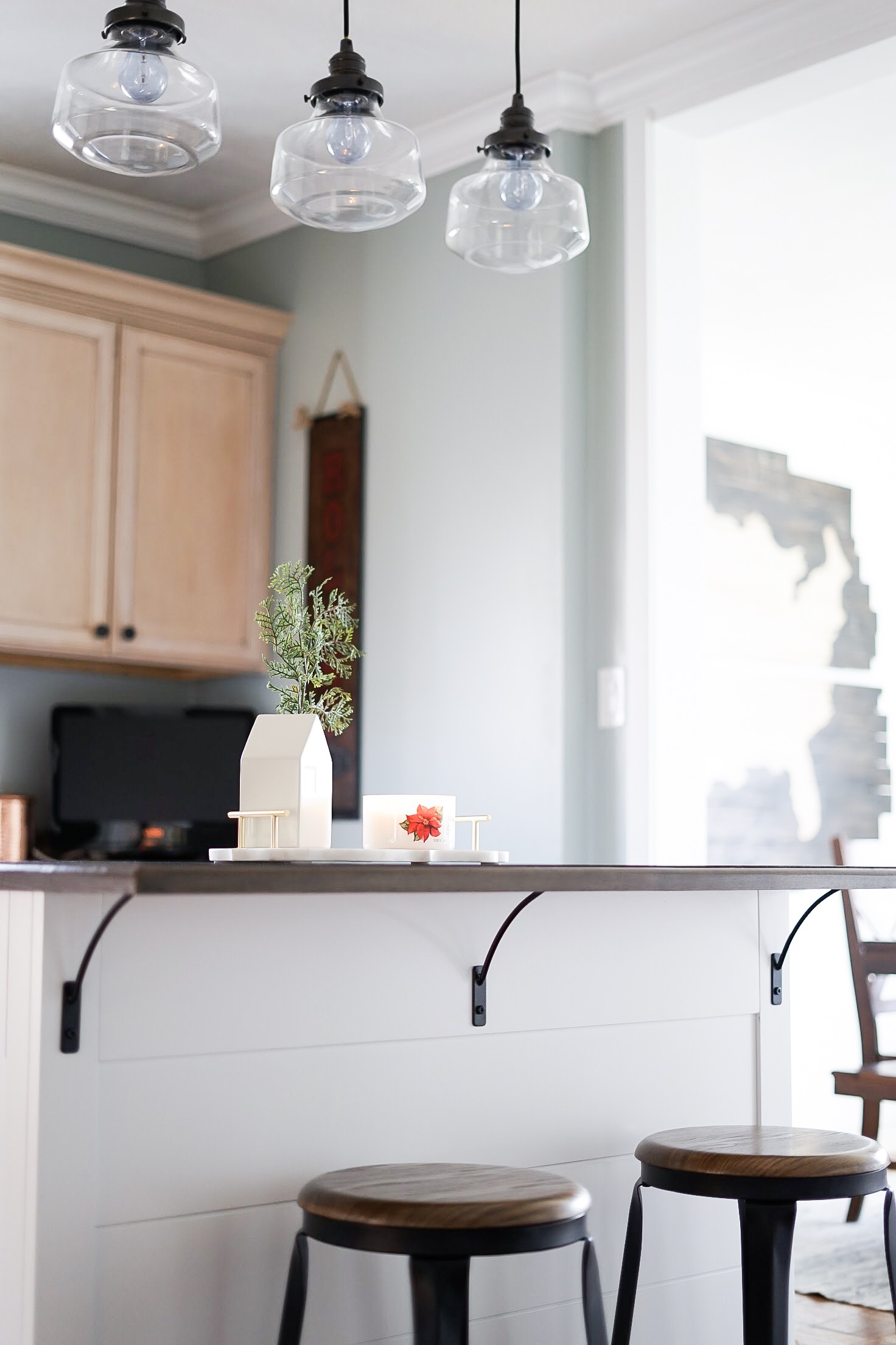
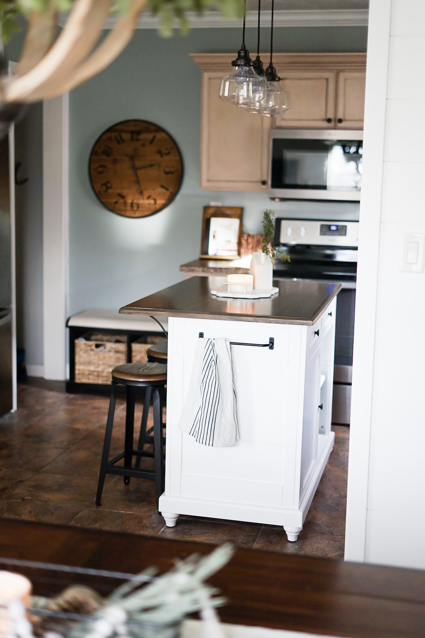
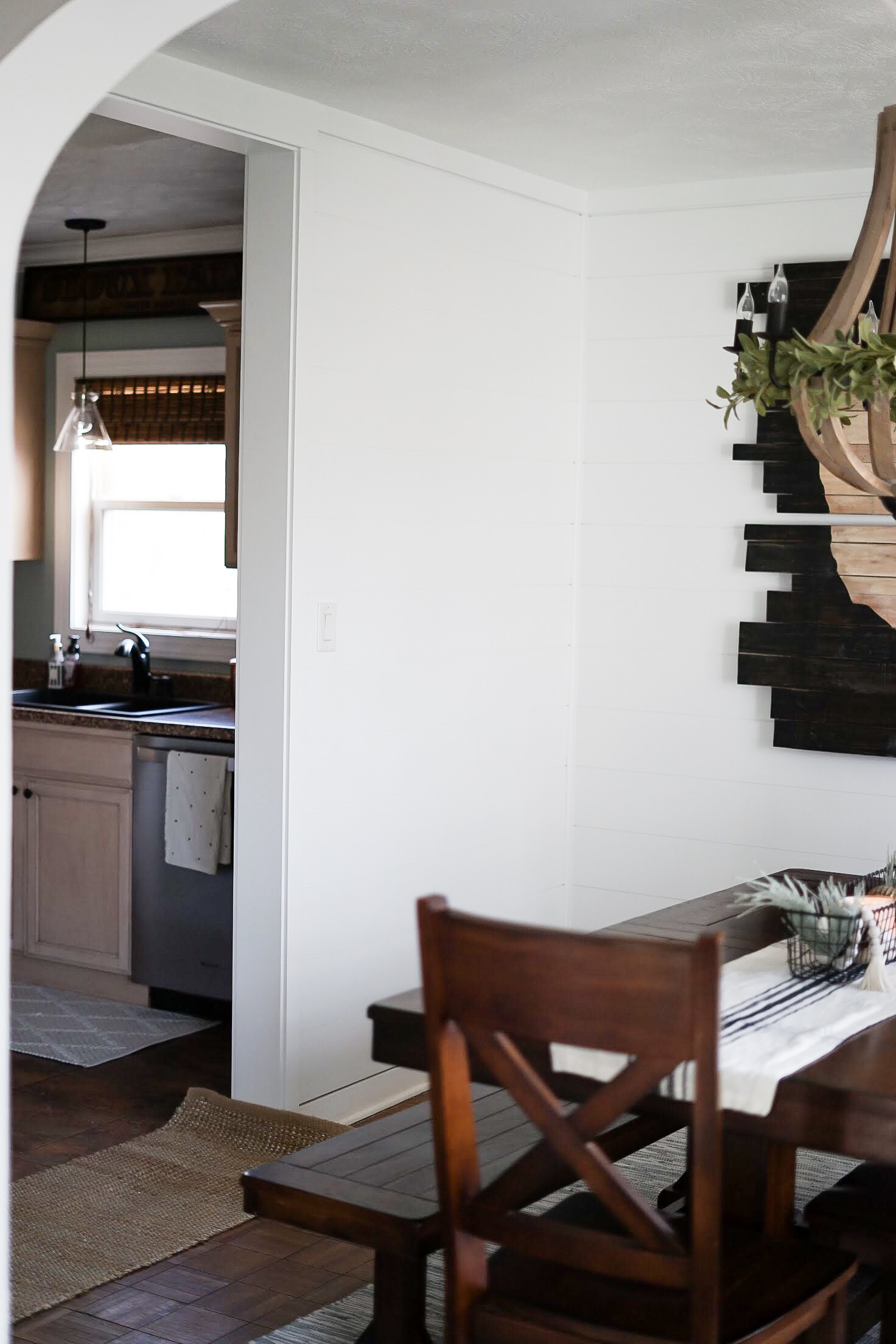
A small portion of the original wall still separates the two spaces since we couldn’t move the plumbing. We hope to find a narrow but tall cabinet to live here to add some storage that we lost when we moved the sideboard that used to be in this room to our basement.
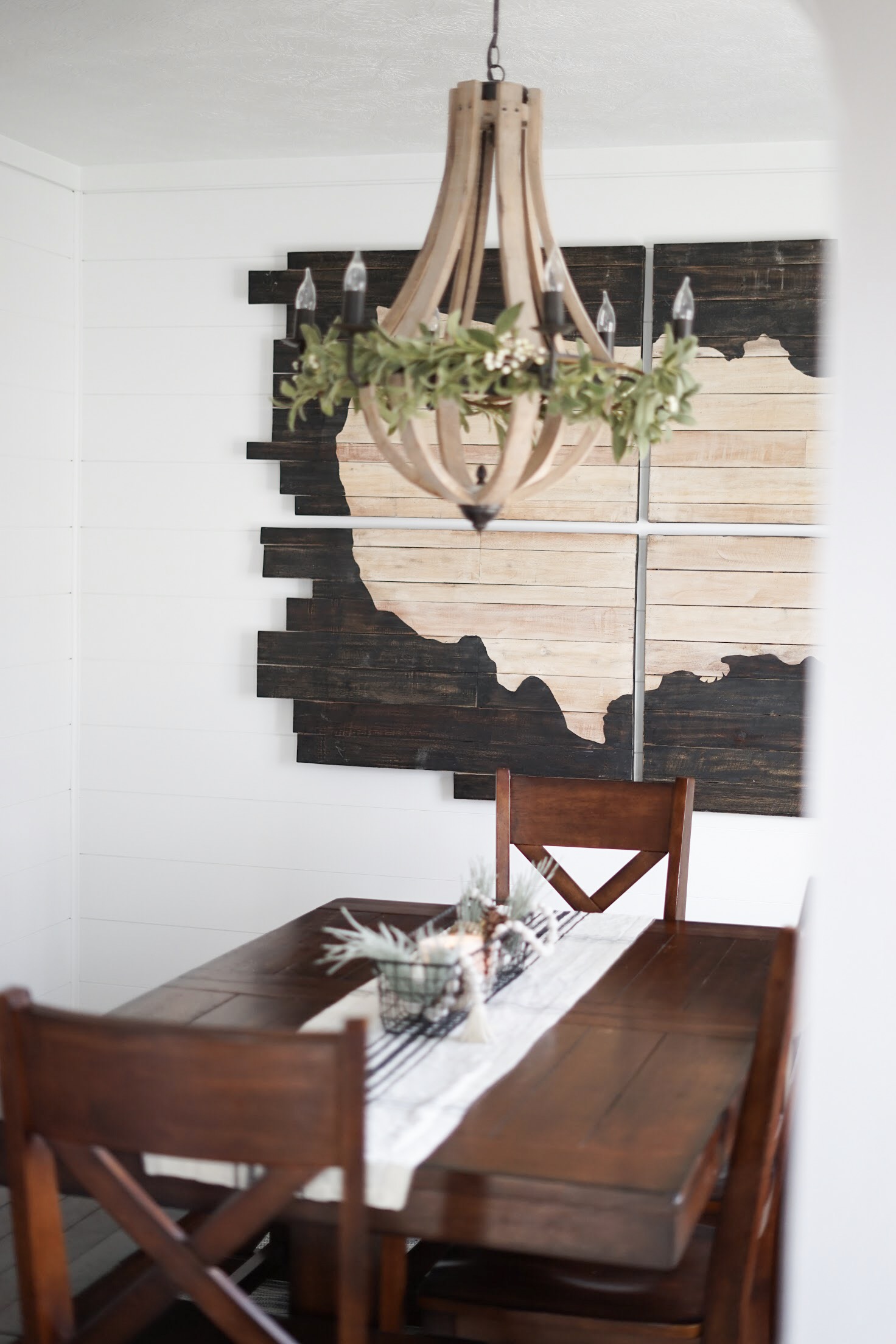
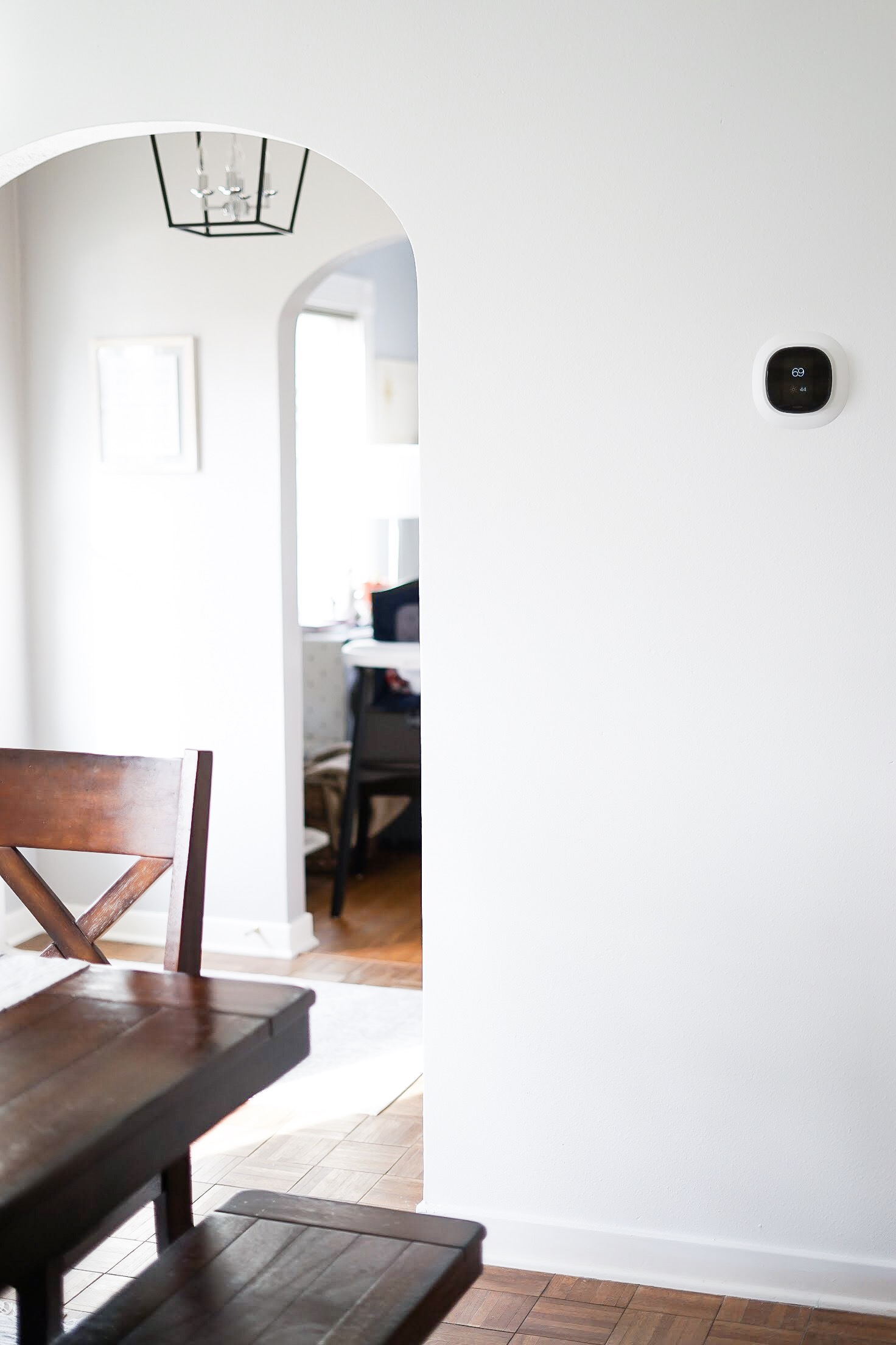
The wall between the dining room and entryway was retextured and painted white to match the other three walls of shiplap.
I also took this opportunity to gift my hubby a smart thermostat for Christmas. We love the ecobee because we can control the temperature of our house from our phones… from anywhere! We also use the built-in Amazon Alexa capabilities on a daily basis.
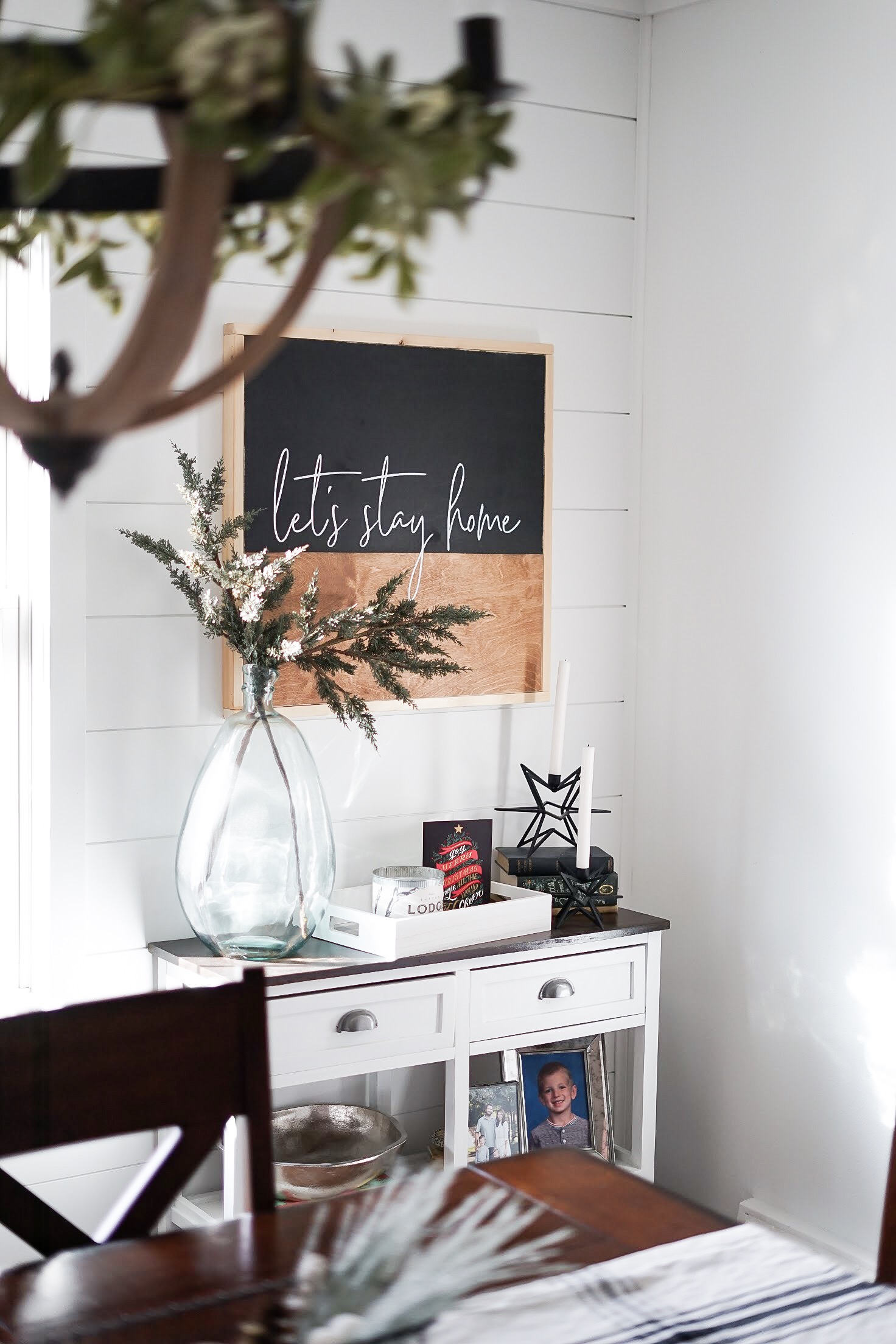
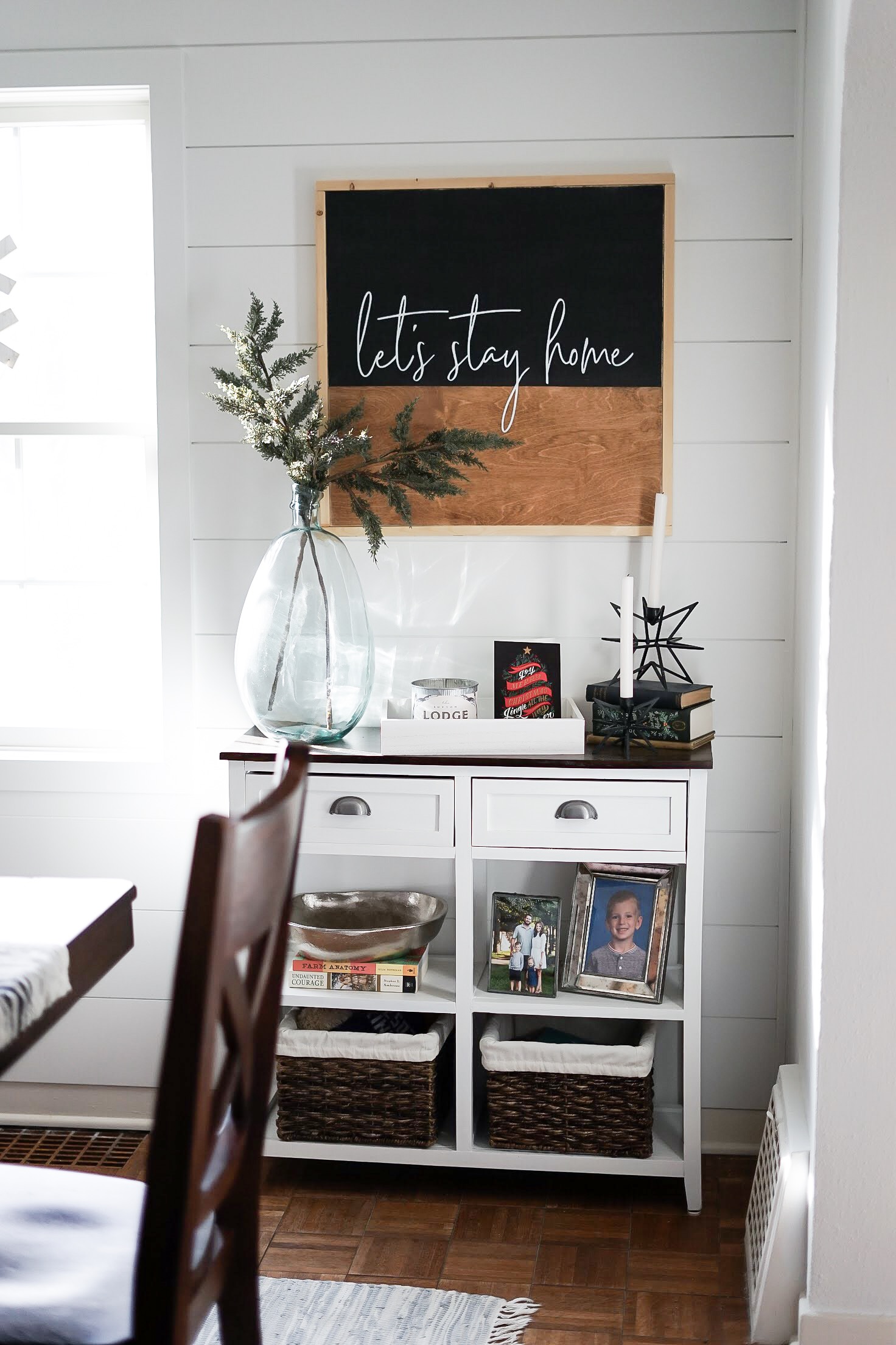
The decor in this room really stayed the same. But the shiplap adds so much interest and we’re so happy to no longer see the thick texture. A huge thank you to Amanda of Dwell 605 for gifting us this gorgeous sign that looks like it was made for this room.
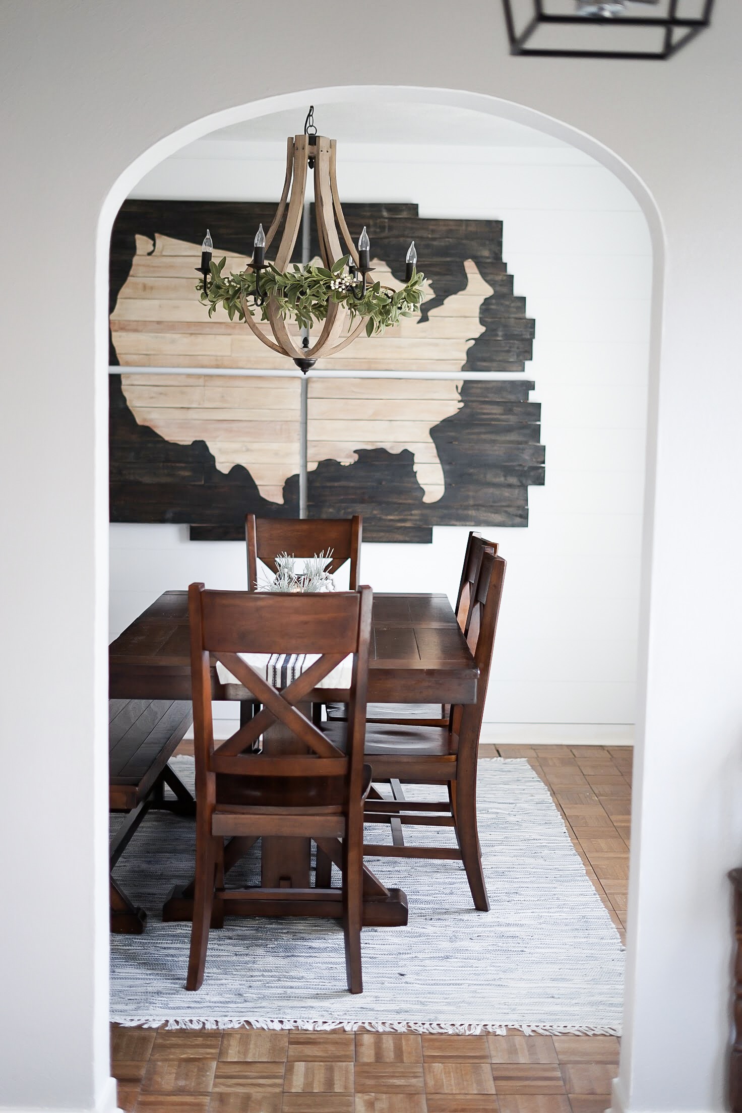
We are truly over the moon about how perfectly this project turned out. Everything came together even more beautifully than we imagined.
We have Erik Wiltgen of Wiltch Construction to thank for his killer skills. He made our dreams come true and construction only took a little over a week to complete! We can’t speak highly enough of Erik and Wiltch Construction.
We’re enjoying a little down time before we tackle the next phase. Next up: floors! The parquet flooring you see in the dining room is covering the original hardwood floor. We can’t wait to tear out the parquet and the DuraCeramic tile in the kitchen so we can have the original hardwood floor refinished throughout the entire main floor.
Let us know what you think of the transformation in the comment section below! We are so excited to continue to share our home renovation with you!
xo
-M
| SHOP THE POST |

 Refinishing Our Hardwood Floors
 Kitchen Renovation Reveal
 Office Holiday Party with Posh Boutique
 Fashion for the Fourth


Turned out beautifully!
Thank you! We’re so excited to keep going!
xo – M
Looks fantastic! Job well done!
Thank you so much! It was such a fun transformation!
xo – M
Wow — love the transformation!
Thank you! We’re so excited to see how everything came together!
xo – M