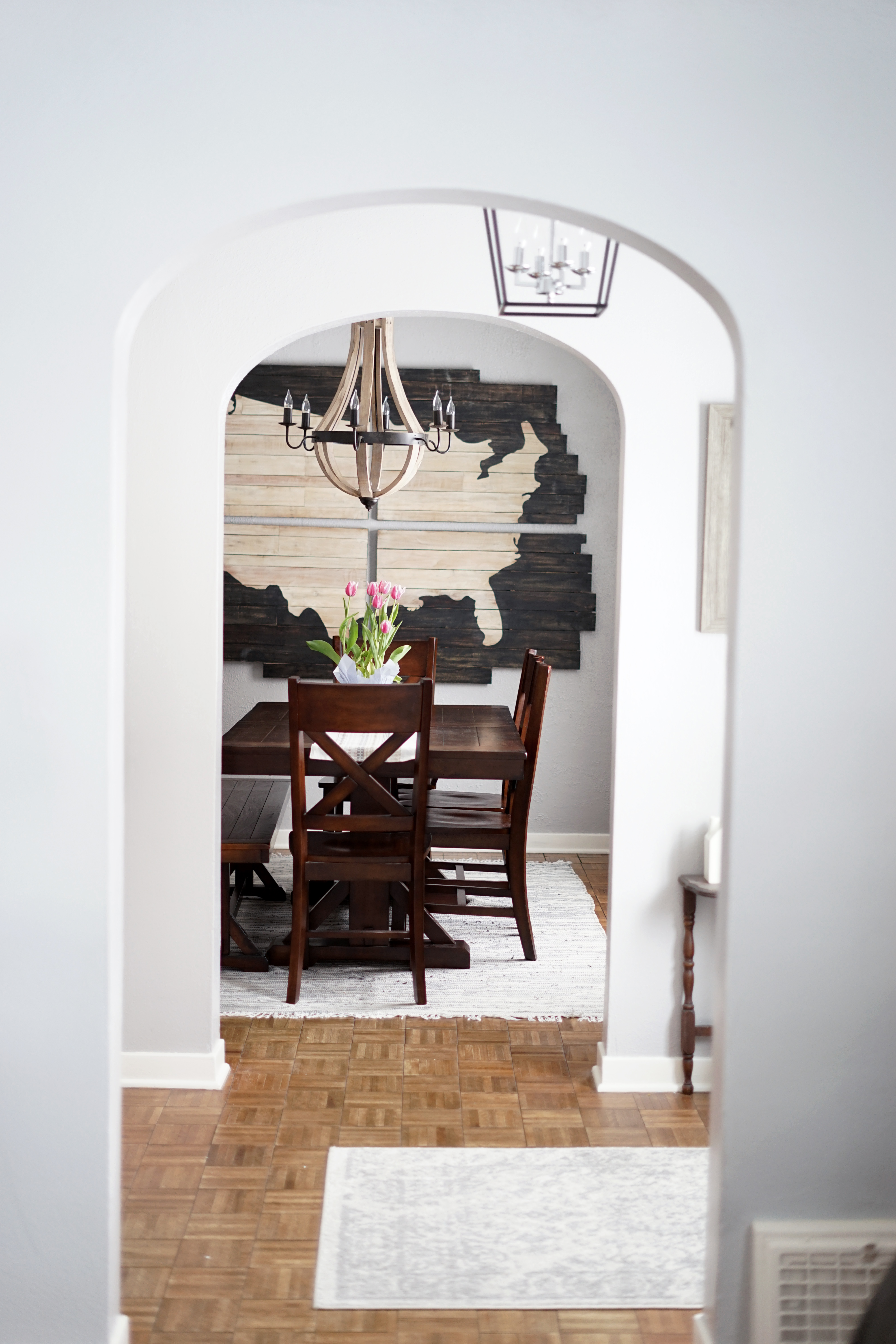
 It’s been quite some time since I shared another part of our home transformation. Our dining room has undergone an incredible cosmetic makeover. It’s a true testament to the ability to look past paint colors and other easy fixes. If you’re able to get in that mindset, you can make your dreams come true with very little effort.
This room has my favorite before and after photos, only second to perhaps our bathroom.
Here’s a peek at what we saw when we toured this home.
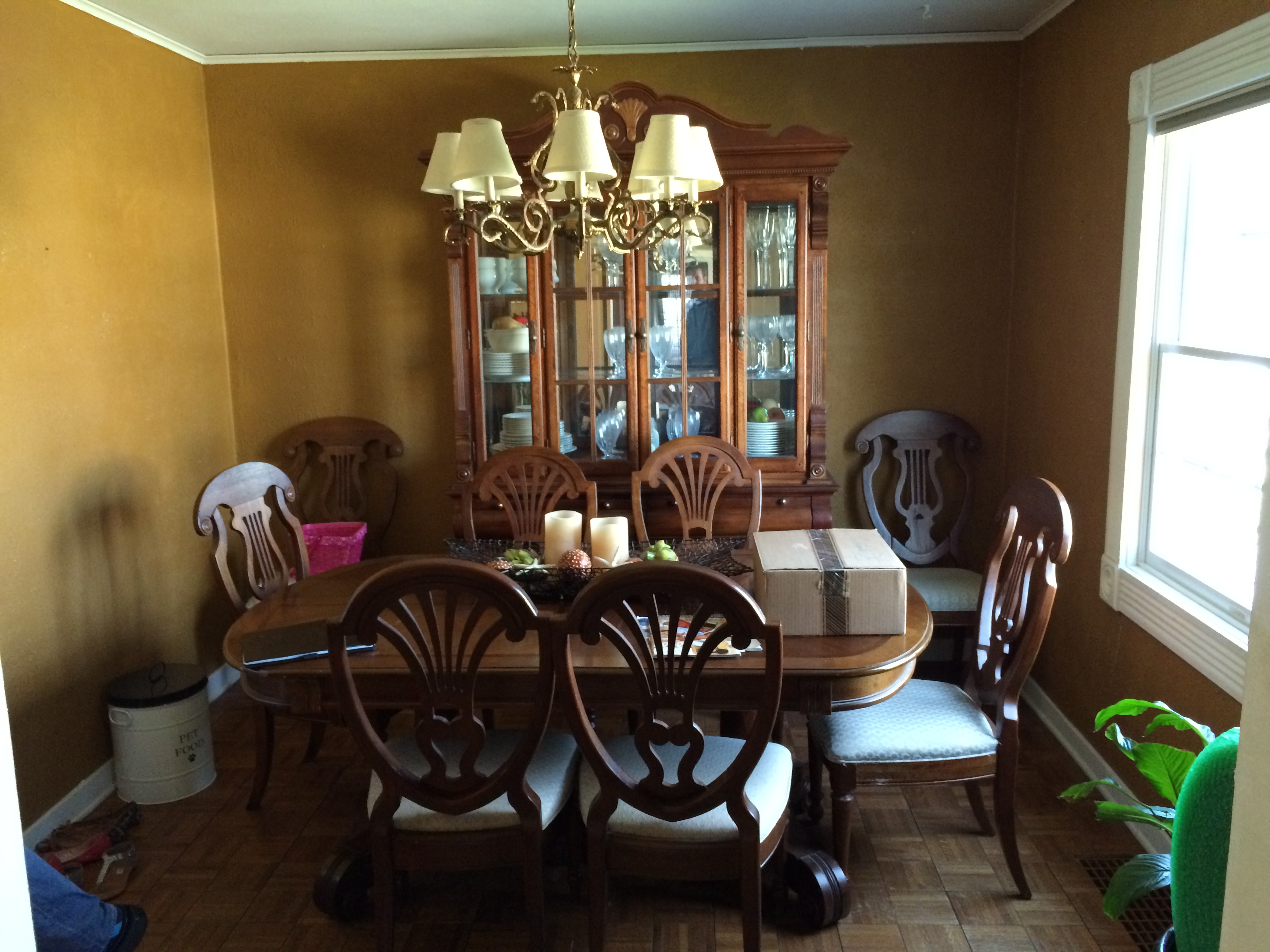 I know I’ve said this before but I have to say it again: everything was just very dark and very brown. Also note that the furniture: while it didn’t belong to us so we knew it wasn’t there to stay, it was very over-sized and arranged in an odd way given the shape of the room and the natural flow of traffic. The door to the kitchen is to the left of this photo opposite the window.
Before we moved anything in, Max and I had a painting party {with some help from several helpful family members 😉 }. But I have to admit, we ended up repainting the first color we chose for this room. We painted it, the entryway and the living room the same color but because this room only had one window, it ended up looking too blue. So, admittedly, we had to repaint the dining room and entryway. Grays are SO HARD! If I have one piece of advice it’s to take your time and don’t feel bad about trying a bunch of swatches. You will be glad you did. But here we are and I’m so excited to share what it looks like today!
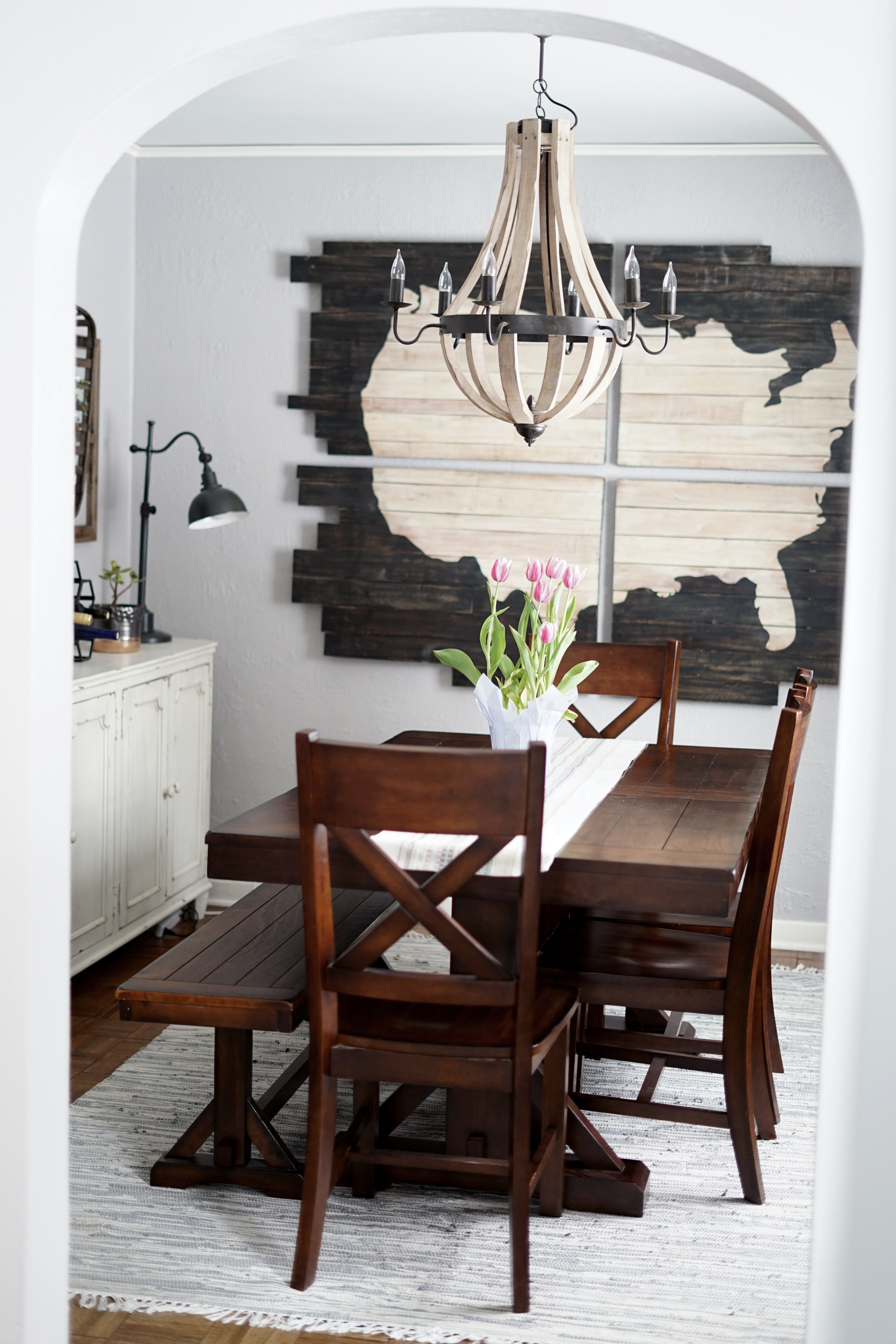 Another bonus that we had going for us is that we came into this house with absolutely zero dining room furniture. Our previous table belonged to my in-laws so we returned that to them as we searched for the perfect one for our family and this space. I love this one {it’s no longer available but I found a similar one here} and it was affordable. With young kids, it takes a beating but it’s been a great partner in family meals. We eat here every single day.
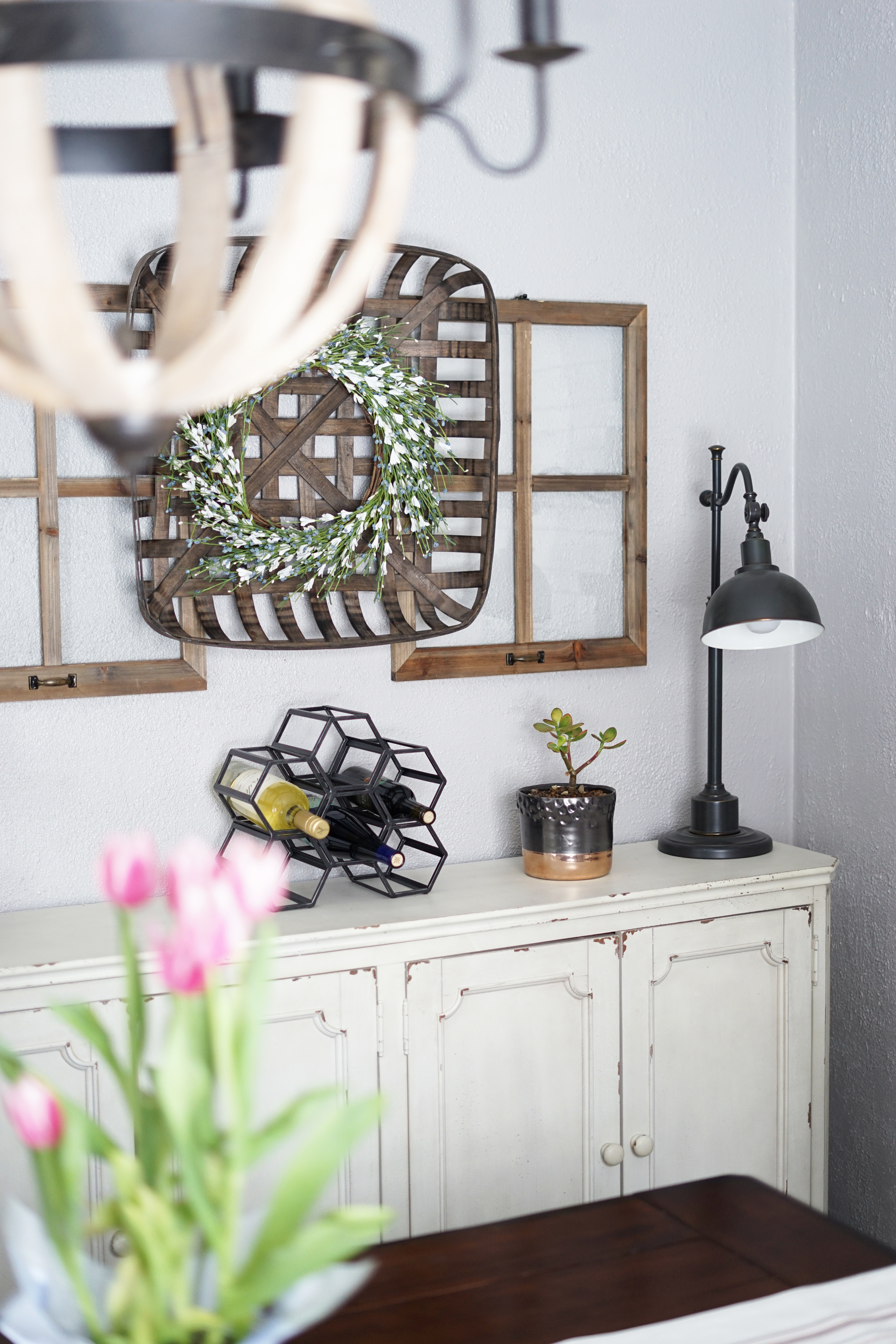
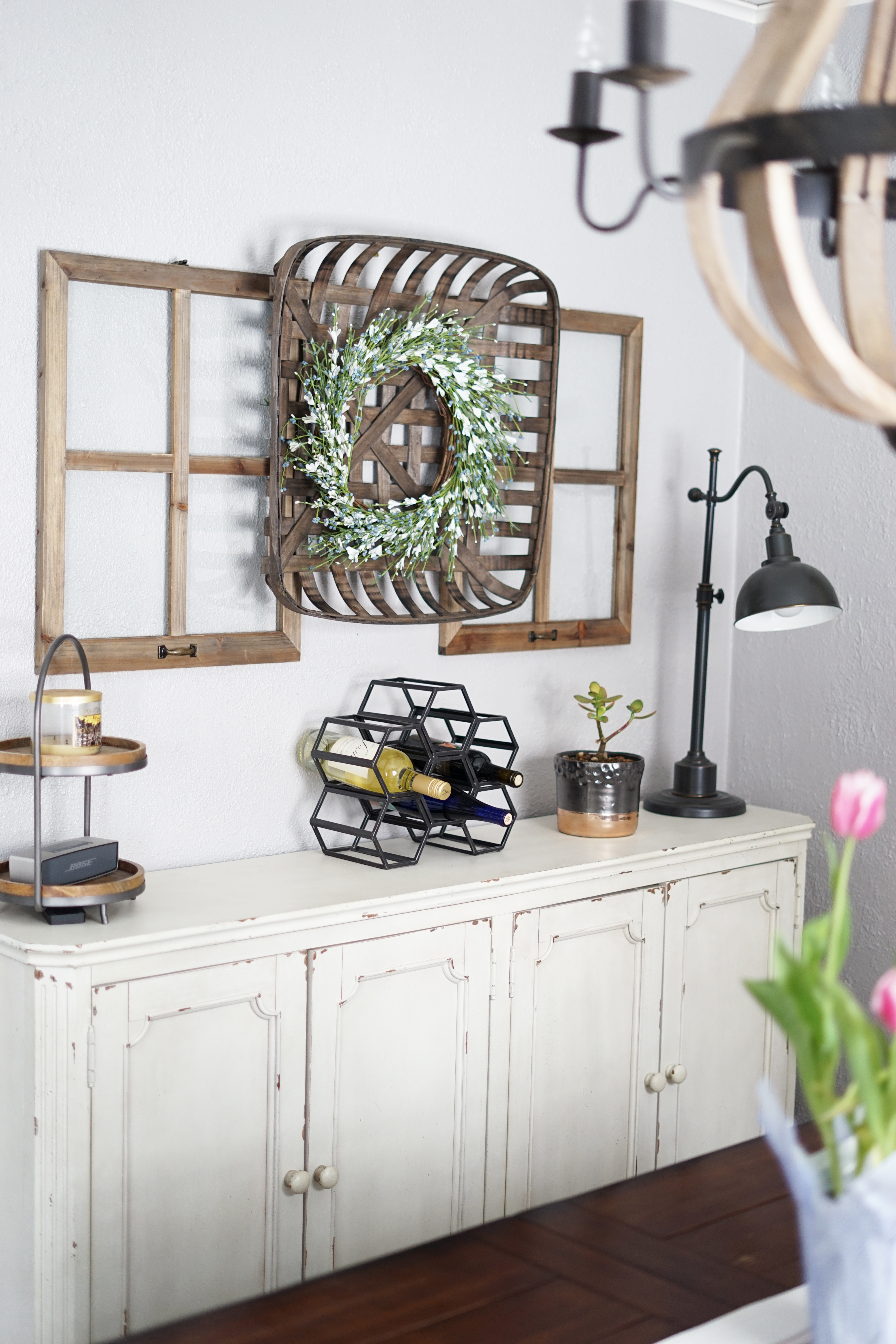 The sideboard took quite a while to find just the right one. The size had to been shallow in depth because this room isn’t all that large. But it’s perfect for this shared wall between the kitchen and dining room. I chose the one with solid doors because it could hide all of the crazy that’s inside. 😉 It’s great storage for us and I’m so thankful that I now have a place that isn’t a plastic tub in our basement to store my great grandmother’s china.
The decor above and on top of this piece tends to change with the season but I love this layered look with the wreath {this one I found at Home Goods but I linked something similar here}, the tobacco basket and these windows.
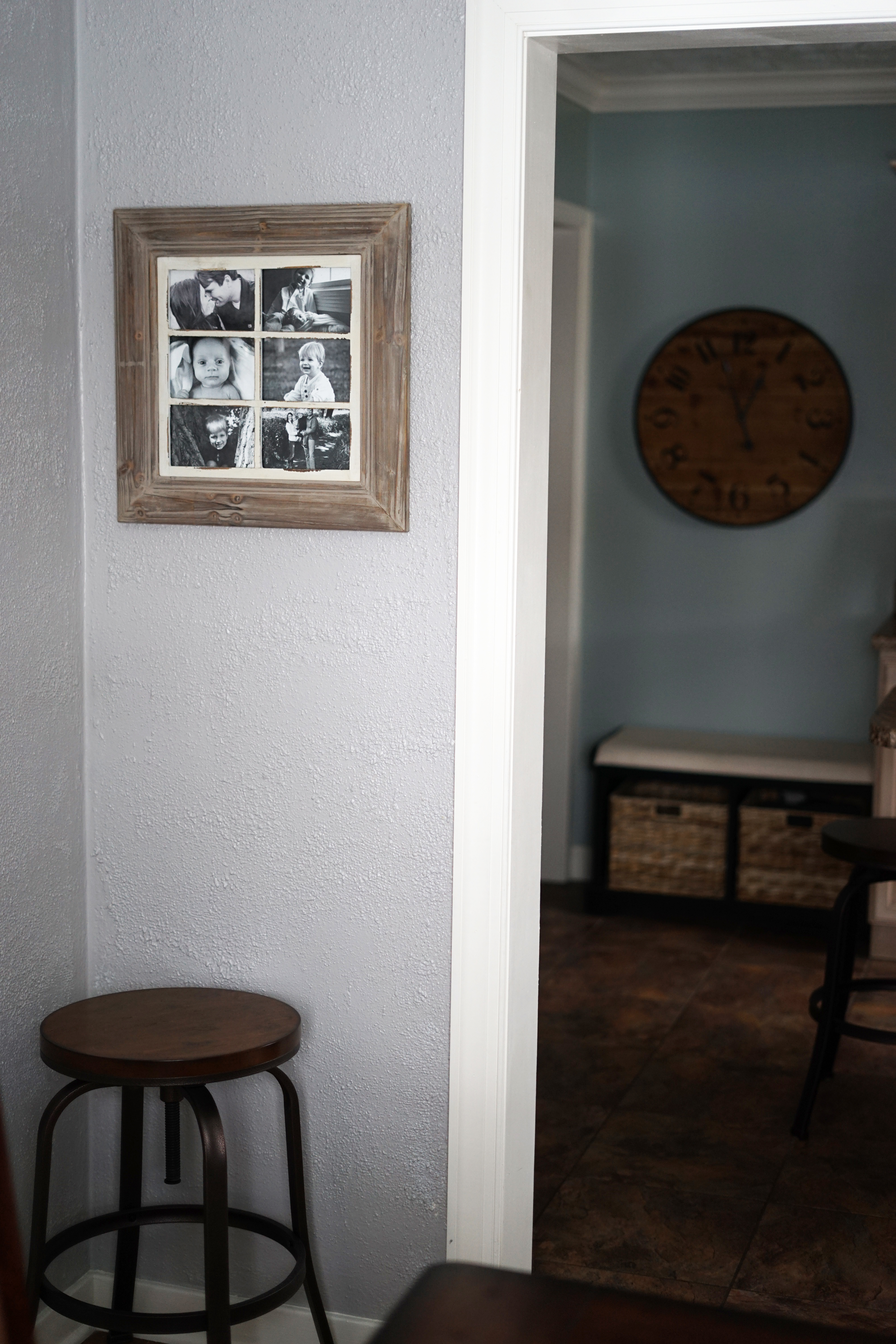
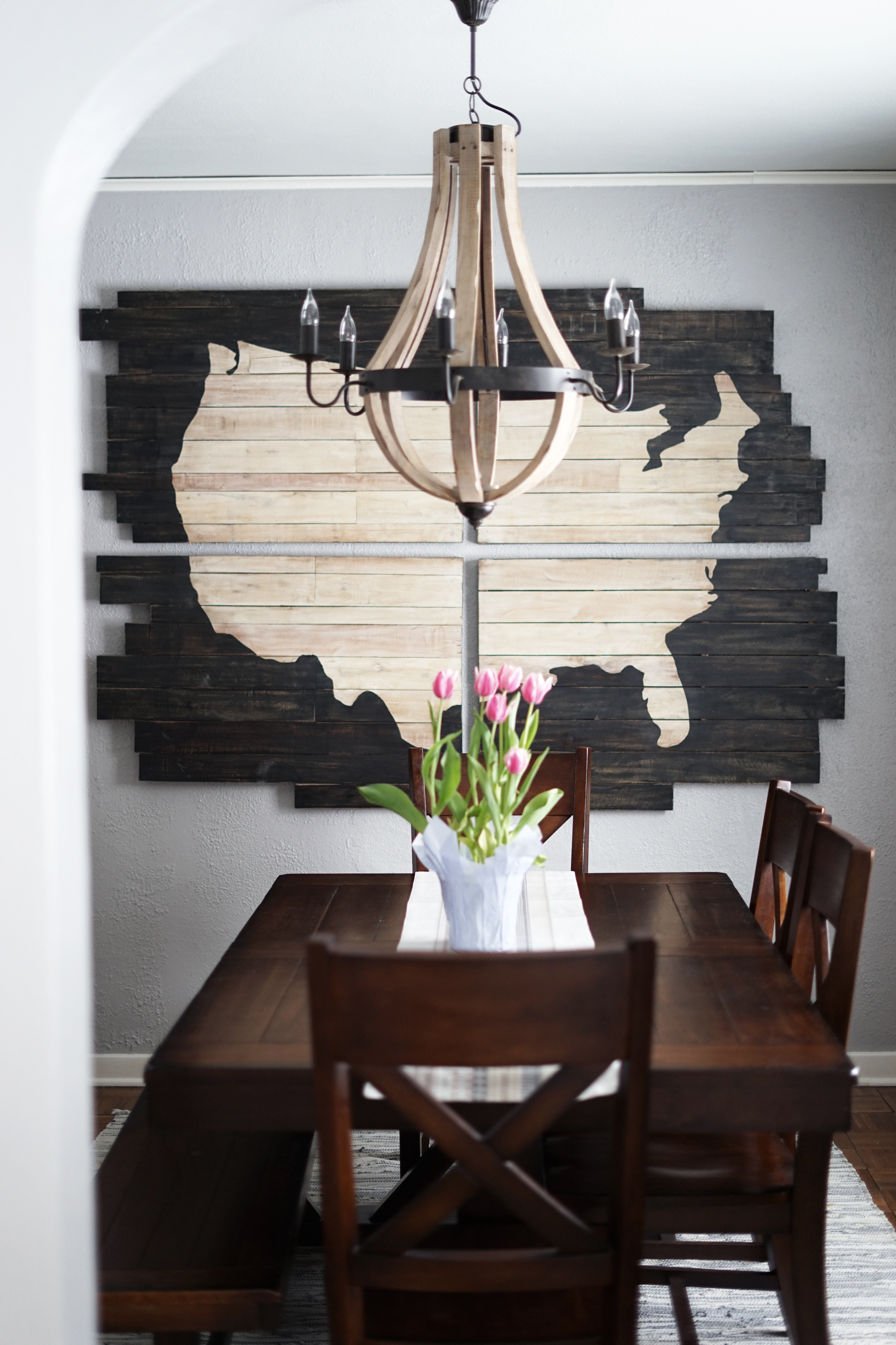 There’s a true ‘star of the show,’ in my opinion, within this space. It’s this giant map art piece that was a gift from my brother-in-law. I fell in love with it several years ago and he gave it to me for my birthday three years ago when we were about to move into this home. It also serves a practical purpose because it hides slight imperfections in the wall where the previous owners took out a window on that wall. I plan to have this piece for so many years to come.
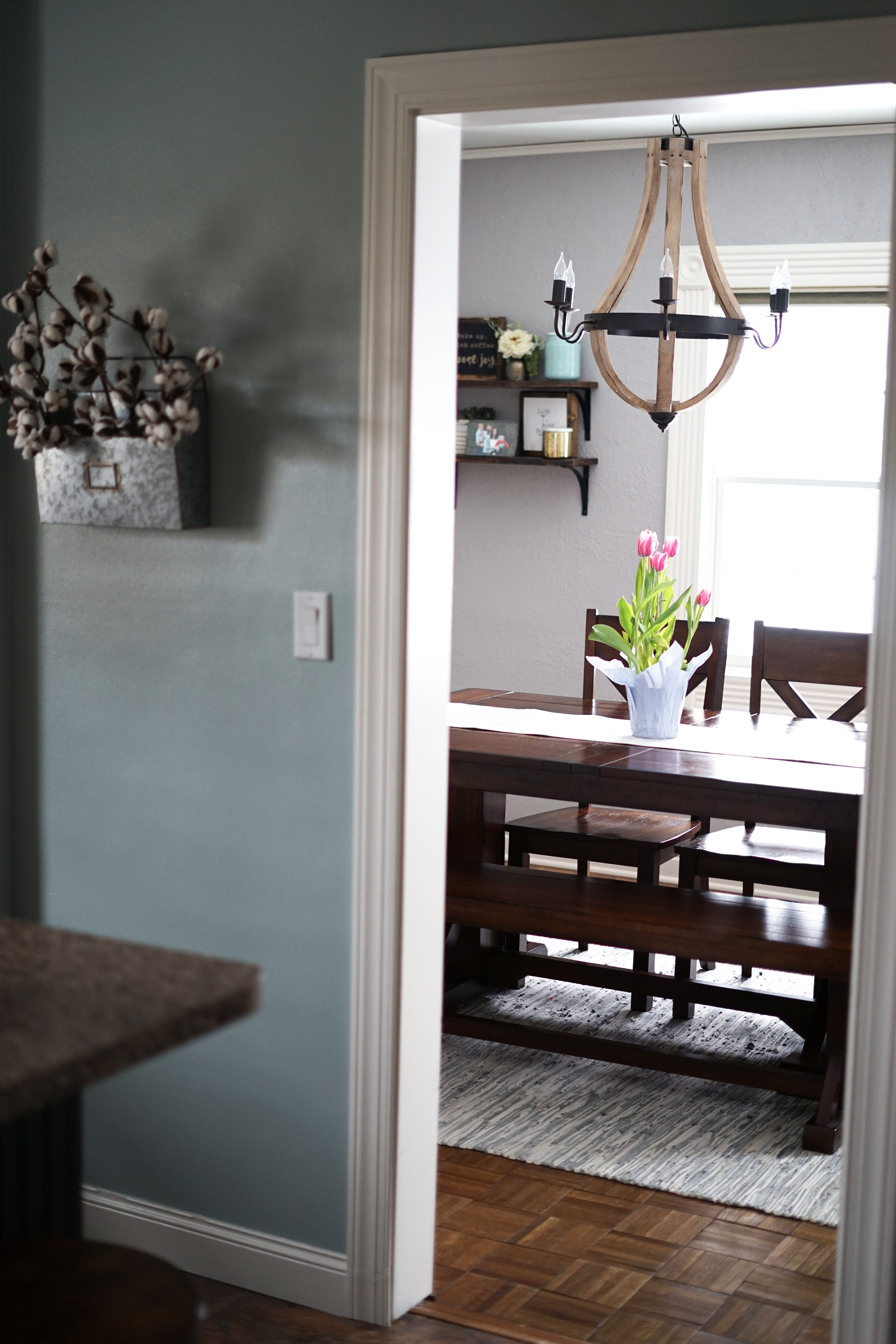
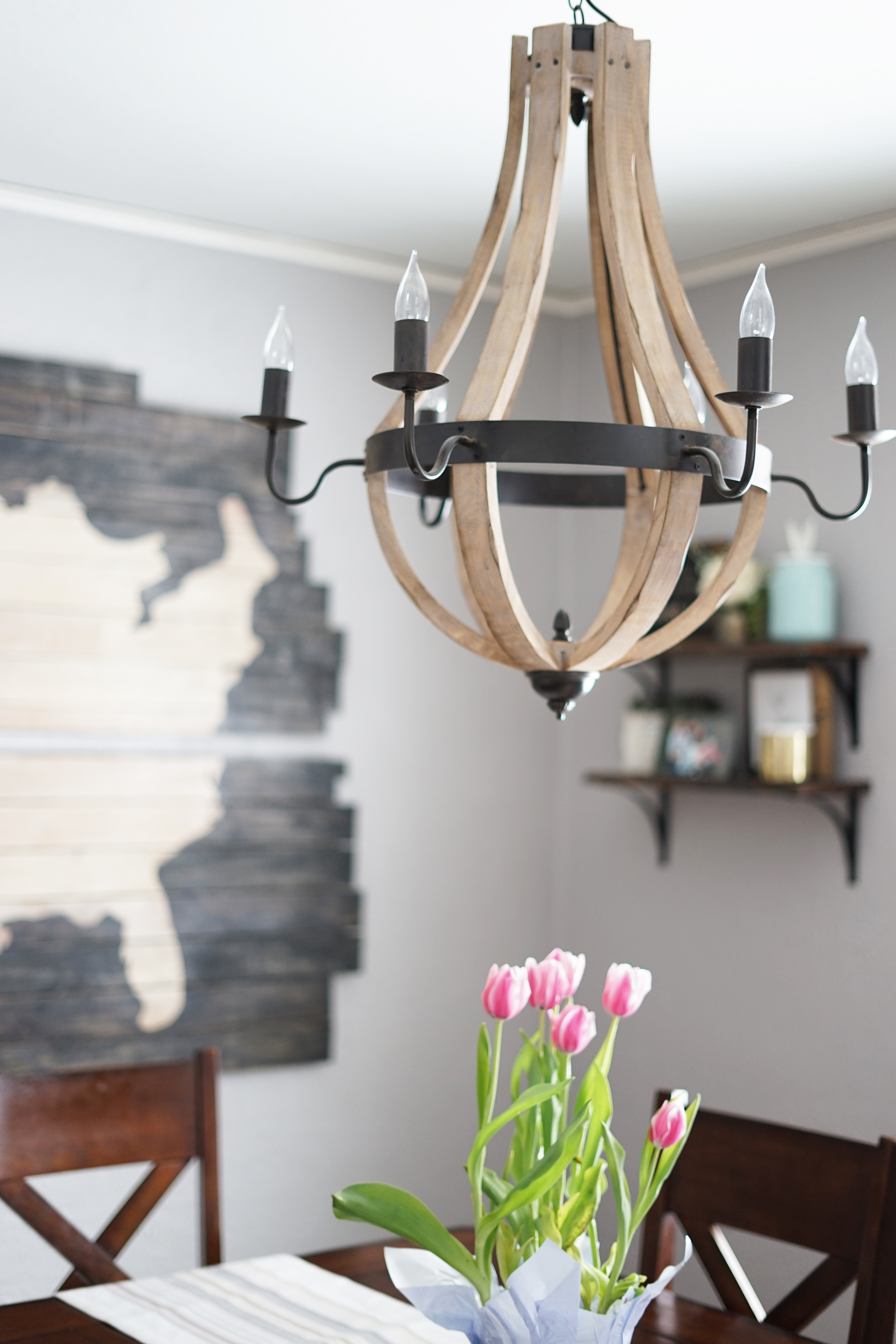 Another part of this room that took me quite a while to find the perfect fit was the light fixture. It’s a large enough room that you need several bulbs to light it but it’s small enough that you can’t have something too overpowering. This wood chandelier is light-weight and fills the space perfectly, both in proportion and light.
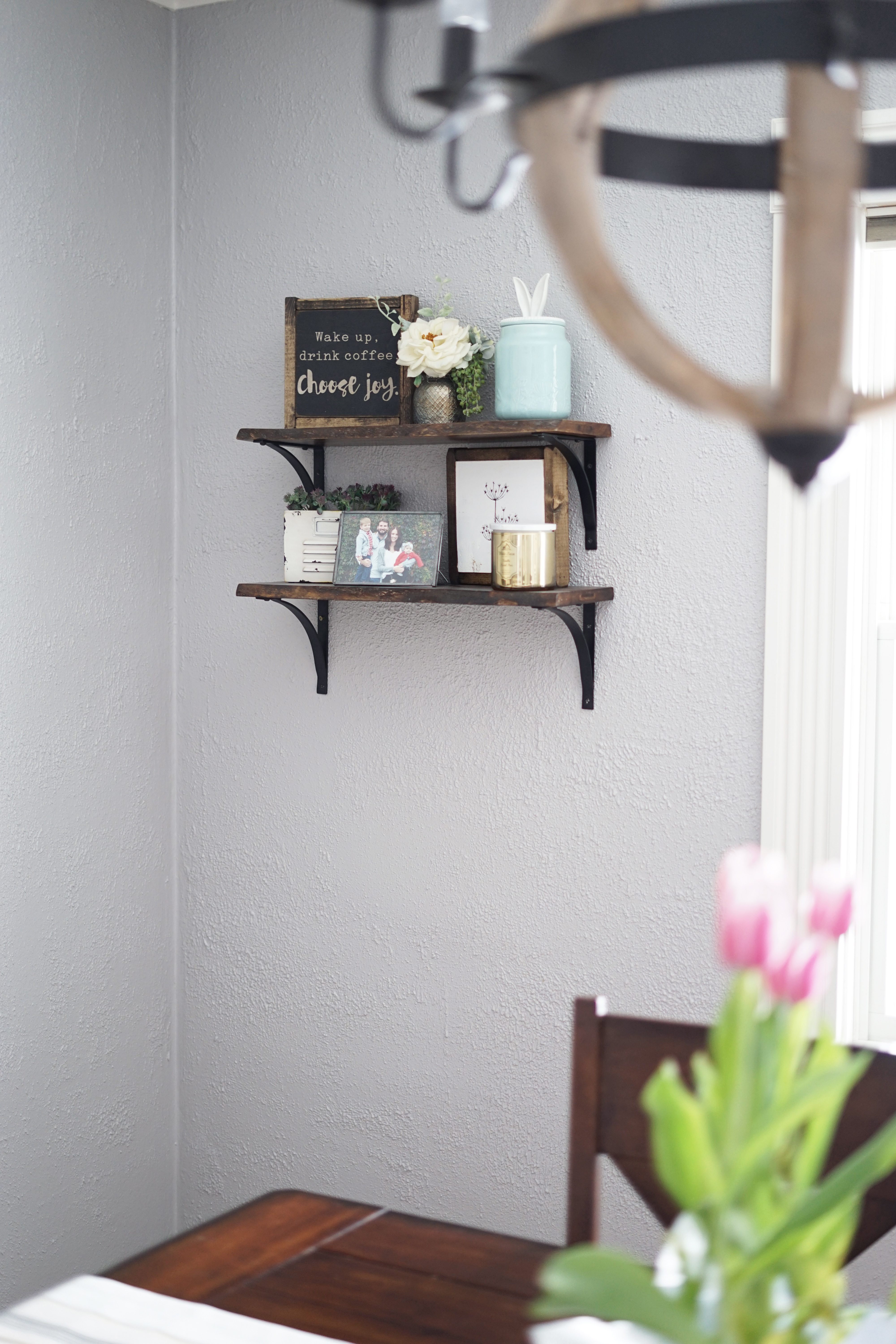 These floating shelves are the perfect place to implement some of our personal family touches. I love changing out the photos and frames throughout the year.
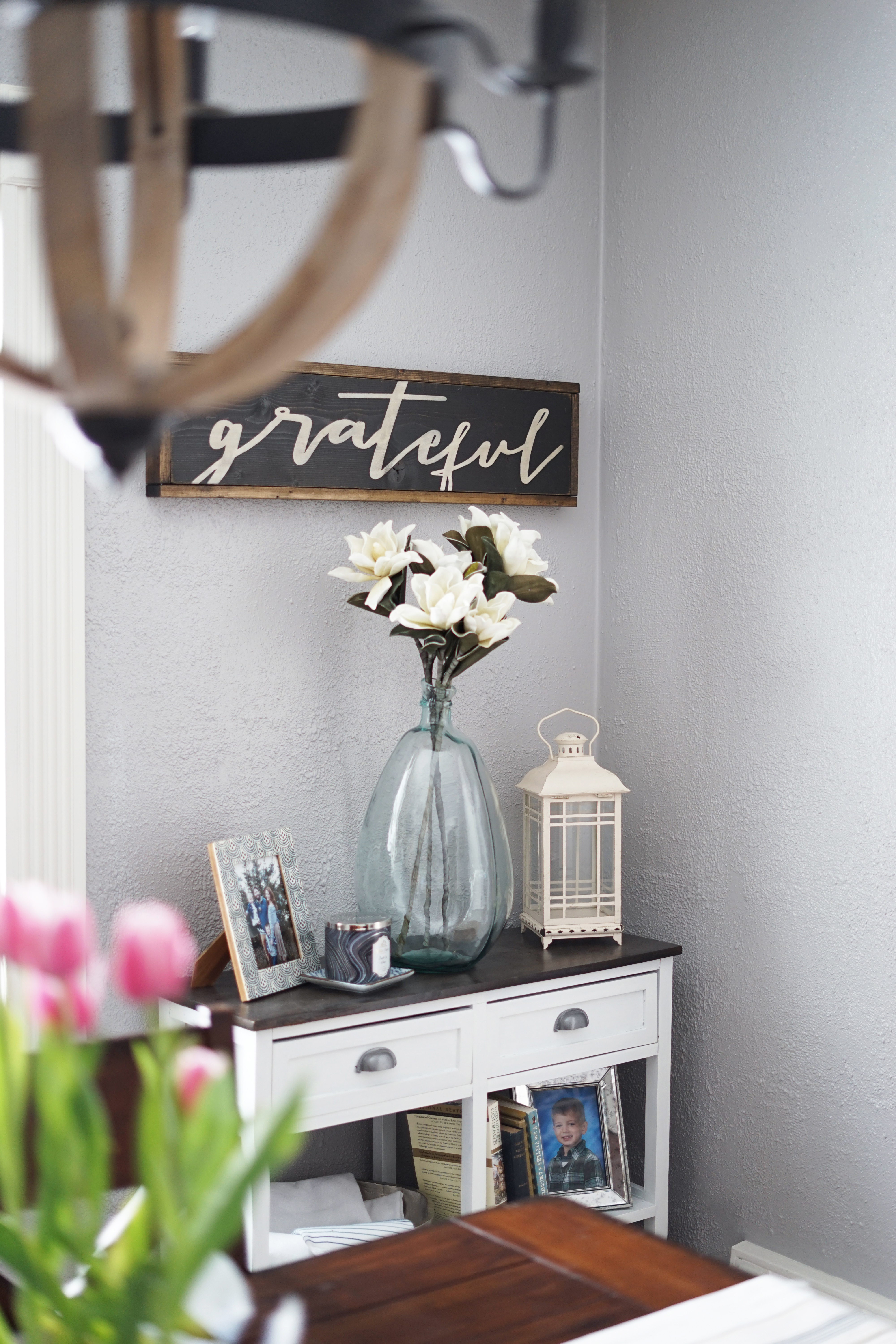 This part of the room was another challenge. Again, I was faced with a small area but I knew I could use some more storage space for our family of four. I found this piece at TJ Maxx {I’ve linked a similar one here and here} and when I brought it home, it was the same color as my dining room table. When I put it in the corner, it was too matchy-matchy and made the room feel heavy.
While my family often makes fun of my obsession with painting things white {haters gonna hate 😉 }, I’m so glad I did! I l left the top the original color so that it could tie the table and sideboard together. I should have taken a better photo from the front so you could see the entire piece but the bottom shelves look just like the middle ones but I’ve added baskets where we throw games and, during the winter, some hats & mittens.
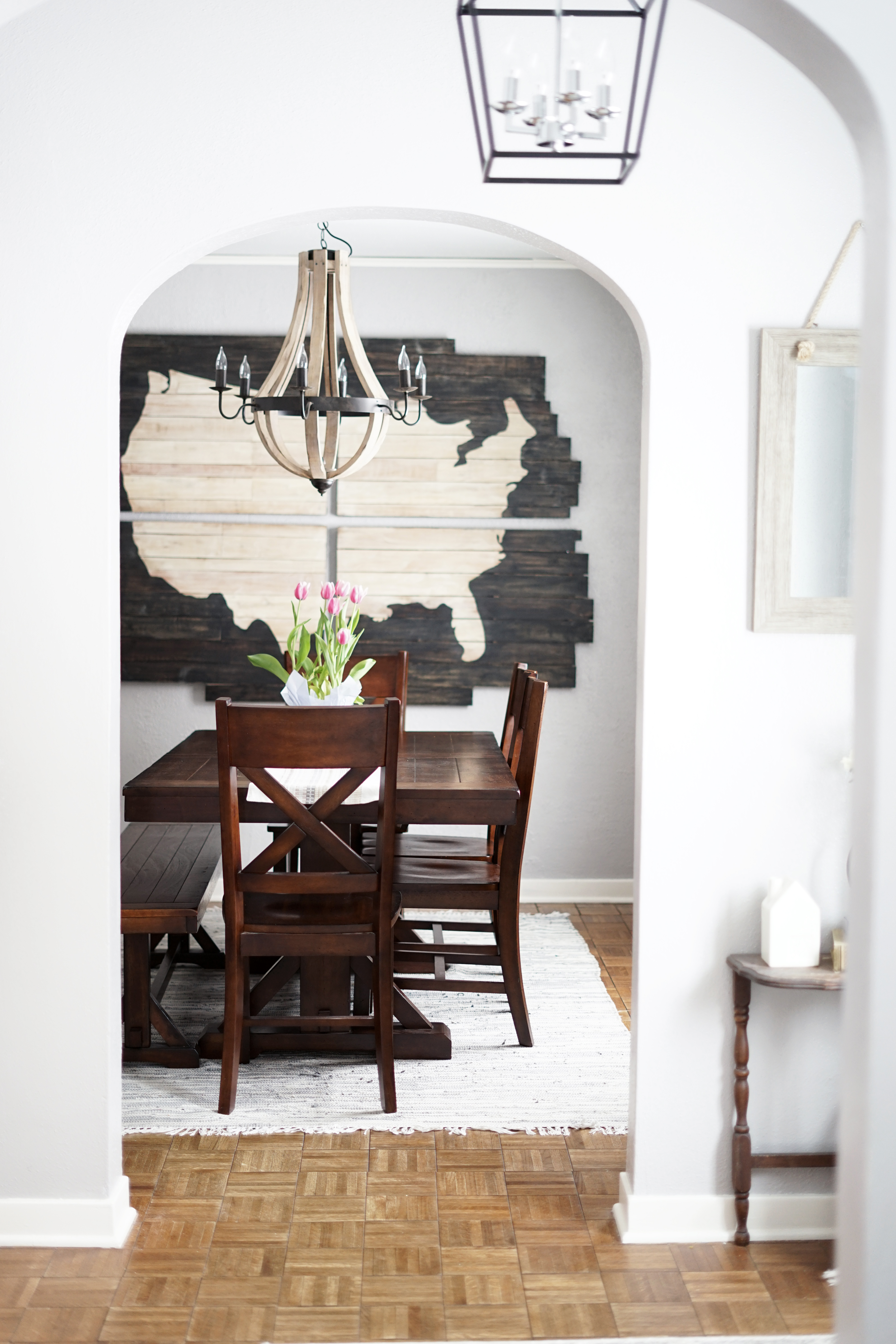 I hope you enjoy seeing these transformations! I love taking a look back at how far each space has come and also remembering how we got them to where they are now. It certainly doesn’t happen overnight but it’s so satisfying once it all comes together.
xo
-M
| SHOP THE FURNITURE |
| SHOP THE DECOR |

 Reintroduction and Refresh of Midwest In Style
 2023 Nordstrom Sale – For Your Home
 Best Sellers of 2022
 2023 Nordstrom Sale – Picks For Him and Kids


Leave a Reply