Now that we’ve walked through the main living space, it’s time to move into the bedrooms and bathrooms! Today’s post highlights what was one of my favorites rooms to design: the master suite.
We had a master suite in our very first home but when we moved into our second house, we gave up that luxury. Back in 1931 when our reno house built, there was no such thing as a master suite. So when we started to plan this new build, we were very excited to have a bathroom that we wouldn’t have to share with the kids.
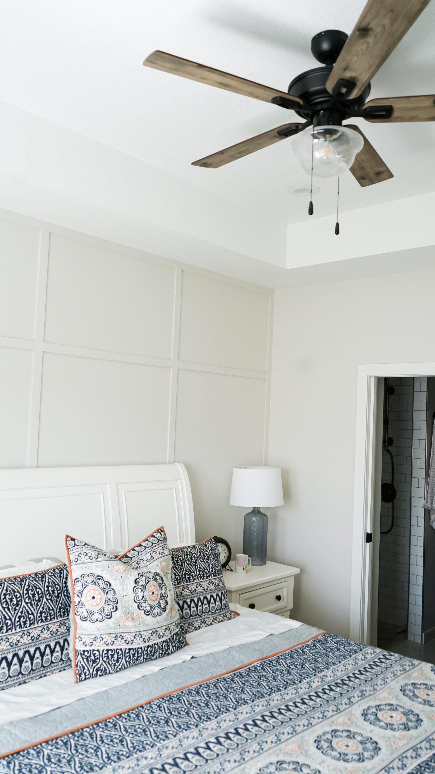
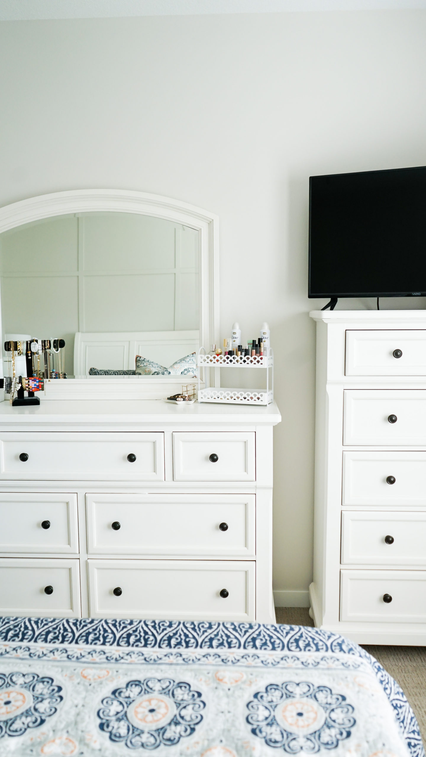
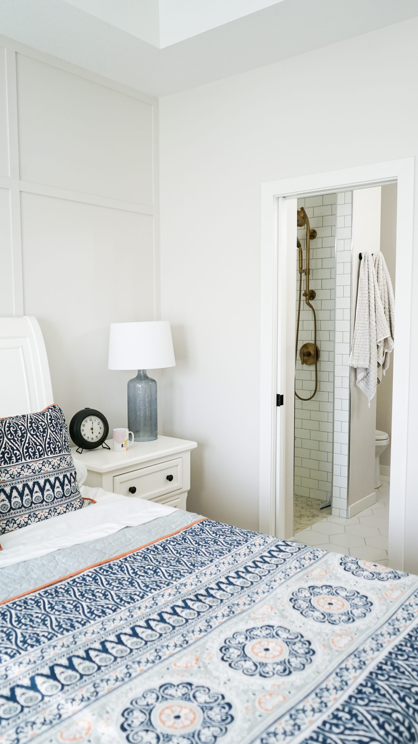
But in an effort not to skip over the master bedroom, let’s start there. We chose to add a tray to the ceiling to make the space feel bigger. This also allowed for some extra room to add a ceiling fan which is a must for Max.
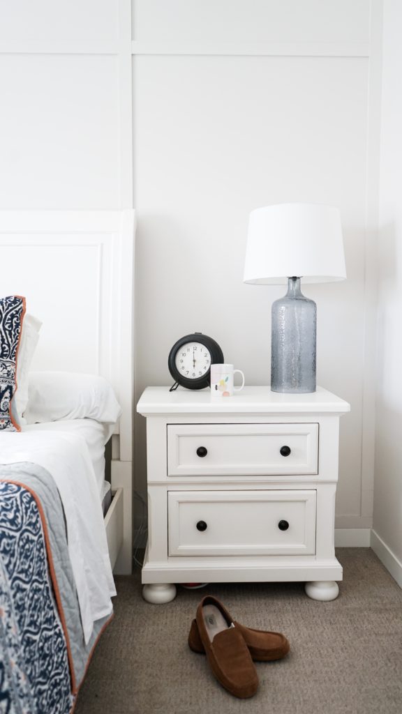
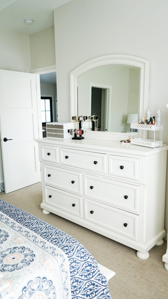
We brought this bedroom set from our last house and while it’s fine in this space, the long-term plan is to swap it out for something a little less over-sized. We will never be able to go back to a queen bed after having a king, however; if you know you know. 😉
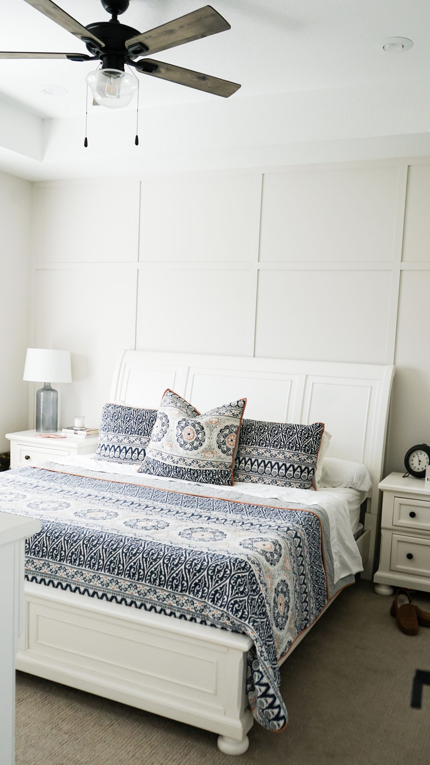
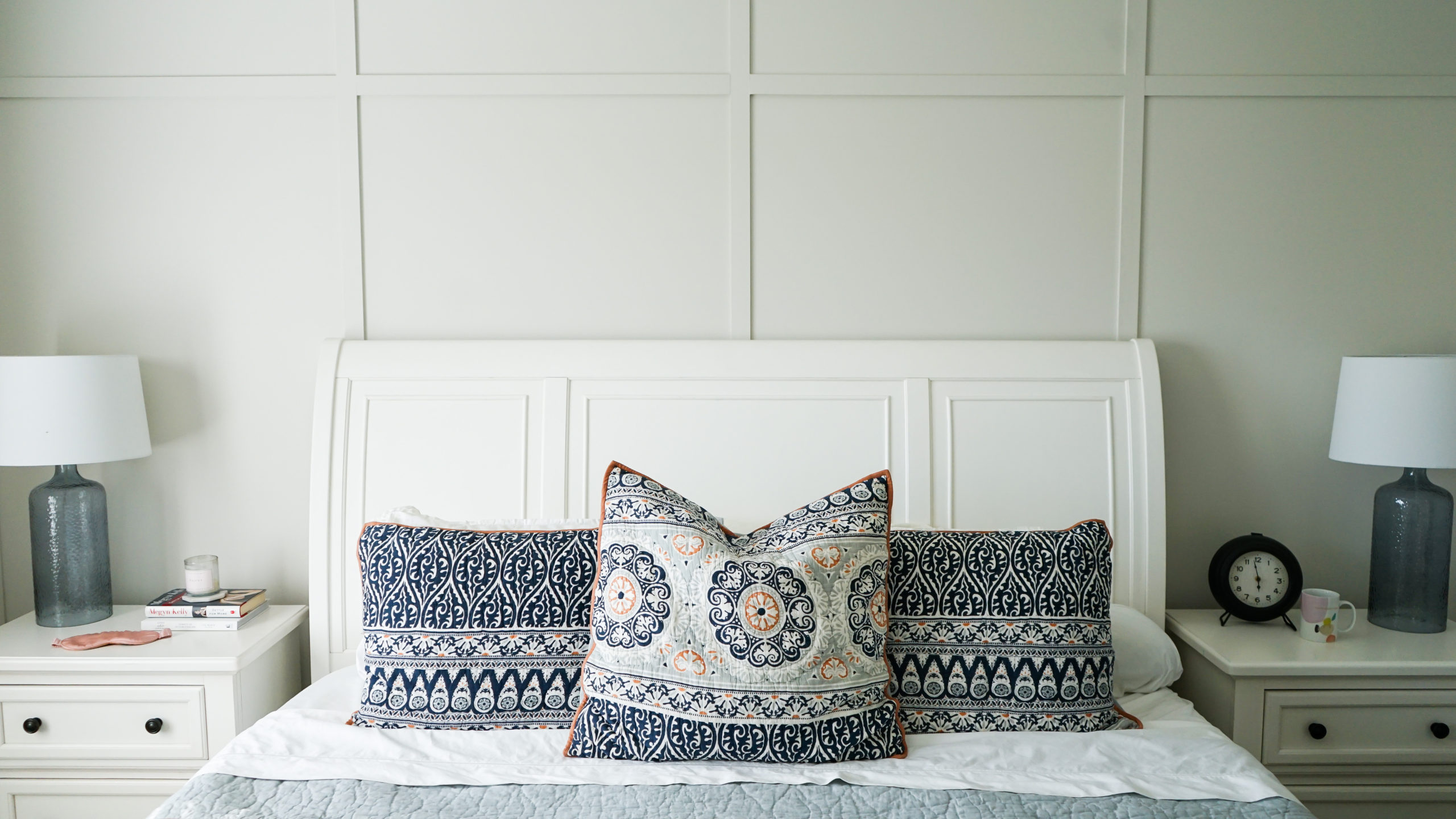
Another added feature of this room is the accent wall. We drew up the plan for this grid wall and have loved how it came to life. We had debated whether or not to make this accent wall a different color from the rest of the walls in the room but in the end we decided to keep it simple and let the dimension of the grid be enough. I think that was the right decision and if we change our minds down the road, we can always paint that wall.
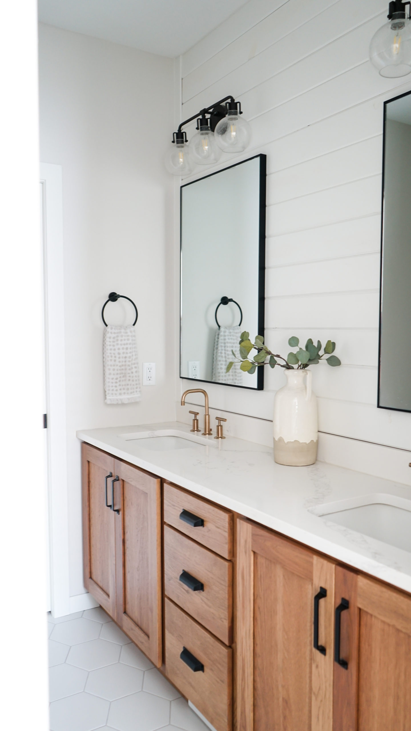
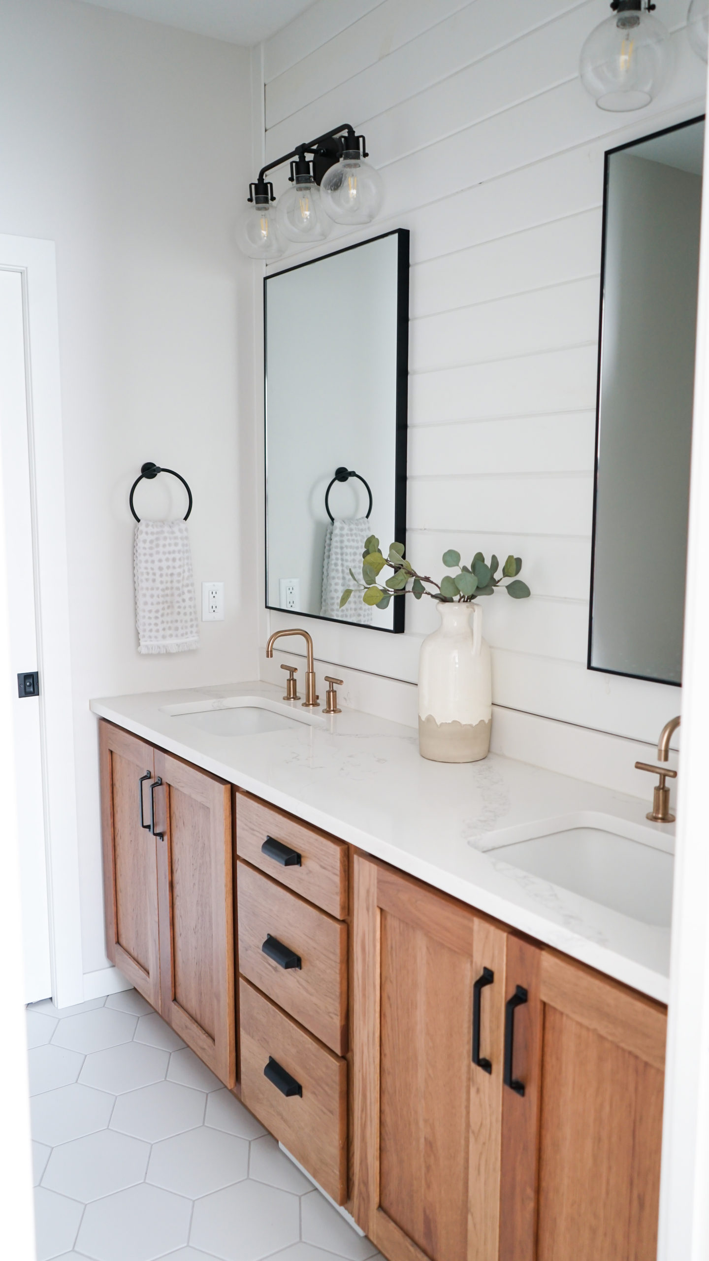
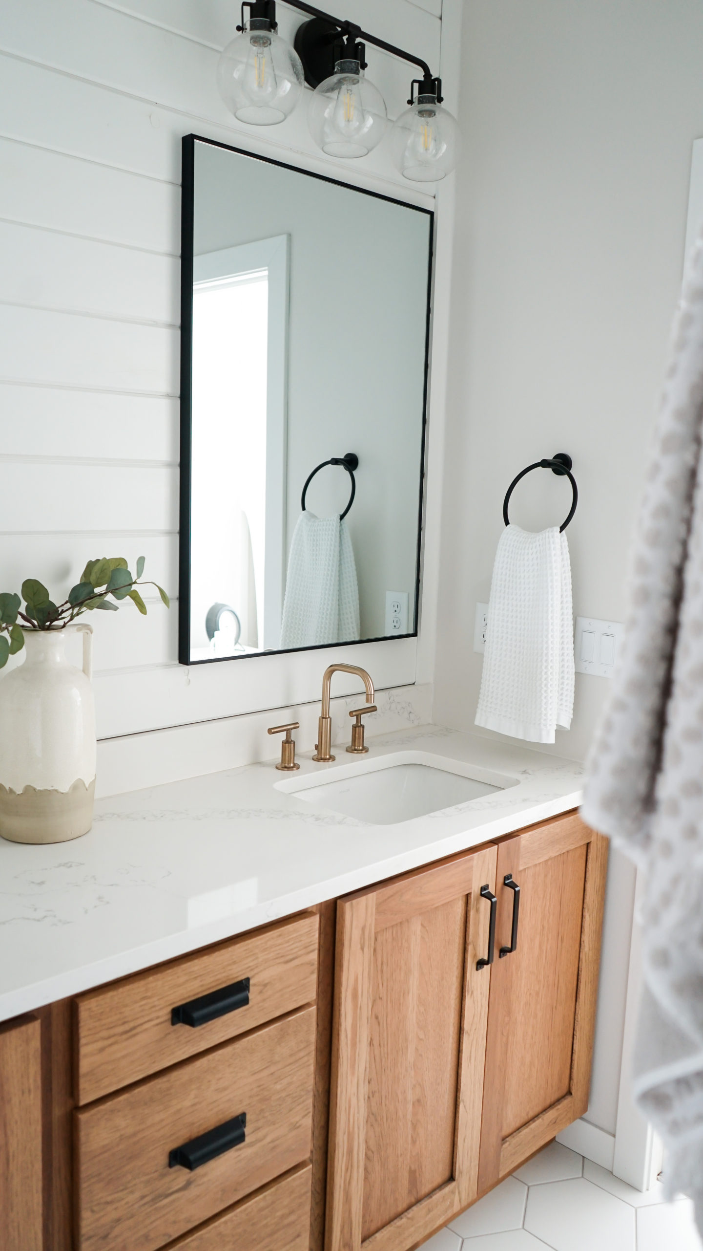
The master bathroom was probably my favorite room to design. We love how bright it is even though it lacks a window. We wanted to keep the white color palette as prominent as possible in the absence of natural light but we chose the same hickory wood that we used for the kitchen island to carry into our master vanity. We had discussed white cabinets for in here but it was going to feel too sterile. The warmth of the hickory has pulled it all together.
| SHOP THE POST |
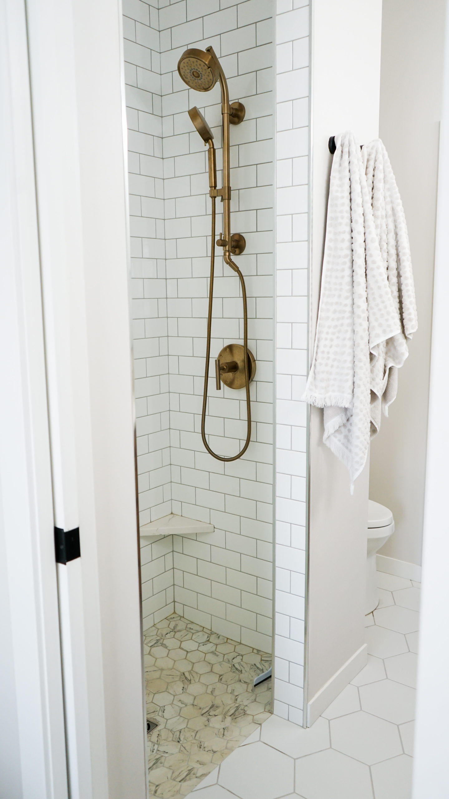
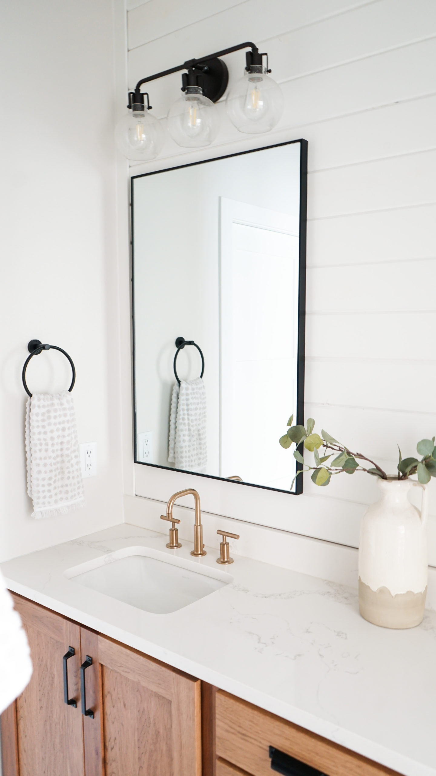
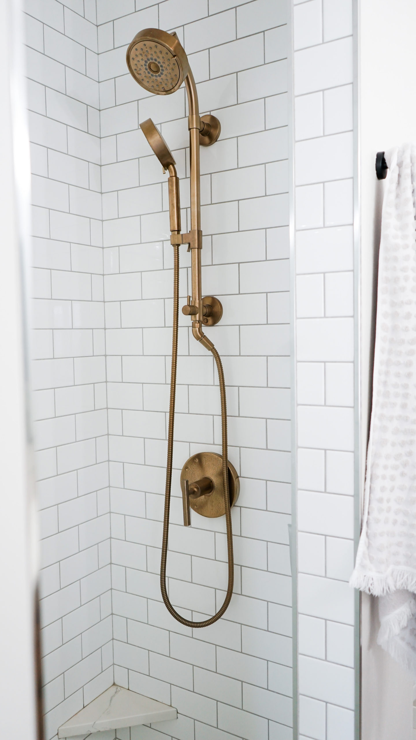
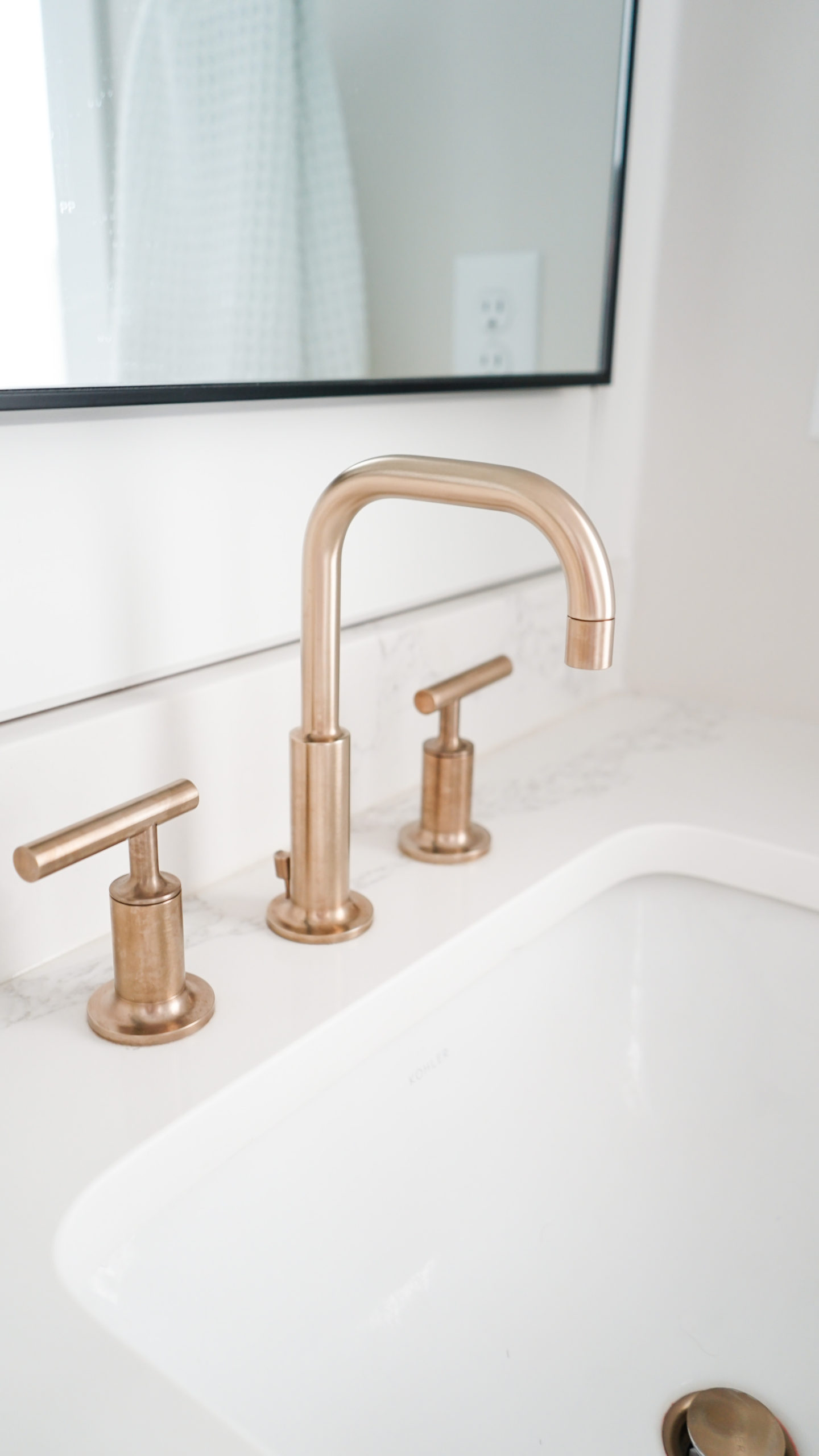
We upgraded a bit on the Kohler faucets and shower fixture to add another bit of visual interest. We chose the Purist line in the vibrant brushed bronze and I couldn’t love them more. The contrast really breaks up all of the white that we chose for the tile, counters and shiplap. Our entire home features Kohler designs; the toilet and sinks in our master bathroom are no exception. The blend of beautiful design and outstanding function is unmatched when you choose Kohler products.
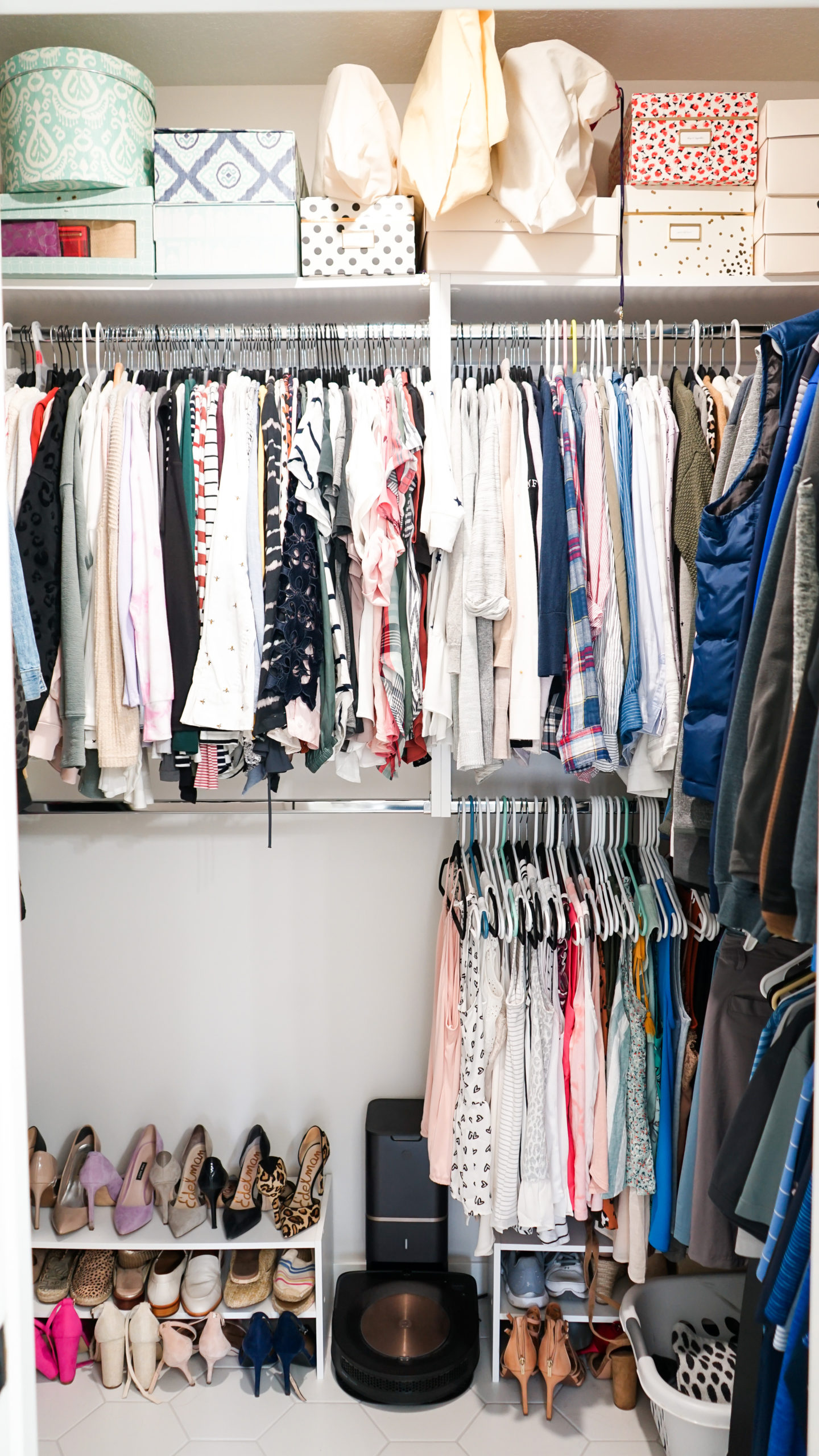
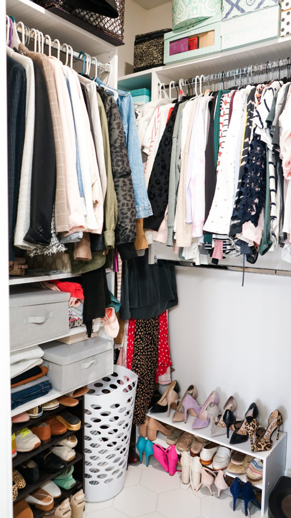
Our walk-in closet is another feature that we have really been enjoying since our last home didn’t have one. It’s shocking to no one that I take over most of this space 😉 but with the stacked double-hanging system surrounding the majority of the space, we have optimized the room to the best of our ability. I’m still refining the organization of it all but we’ve made a great start.
One thing I’m really glad we did was carry the tile in the bathroom all the way into the closet. It is easier to clean, makes the space seem larger and also makes me feel less guilty about having shoes around the entire perimeter. 😉
I want to know which of the rooms that I’ve shared so far are your favorite! Tell me in the comment section below!
xo
-M
Editors notes: master bedroom ceiling fan – Menards // bathroom lighting – Holland House // wall color – City Loft by Sherwin Williams // master bathroom cabinetry – Showplace Cabinetry




 Reintroduction and Refresh of Midwest In Style
 Primary Bathroom Update
 Easy Ways to Upgrade Your Home
 Why I Got Botox & Botox FAQ’s


I love this master suite! Can you please provide a link for the mirrors you used in the master bathroom?
Hi Megan! Thanks for reading! Unfortunately the mirrors we purchased for the master are no longer available but I did link a similar version for you within the post. Let me know if there’s anything else I can do to help and thanks again for stopping by!
xo – M