
I had asked on Instagram Stories which room to start with for the full house breakdown and, overwhelmingly, you requested to see the details of our kitchen!
The entire main living space was designed for entertaining and it really starts in this kitchen. We have always wanted a large island because it tends to be where people are most likely to gather. Ours has been no exception. While we haven’t been able to host many gatherings yet due to COVID-19, the few events that we held at our new home proved we had made the right decision in how we had set up this space.
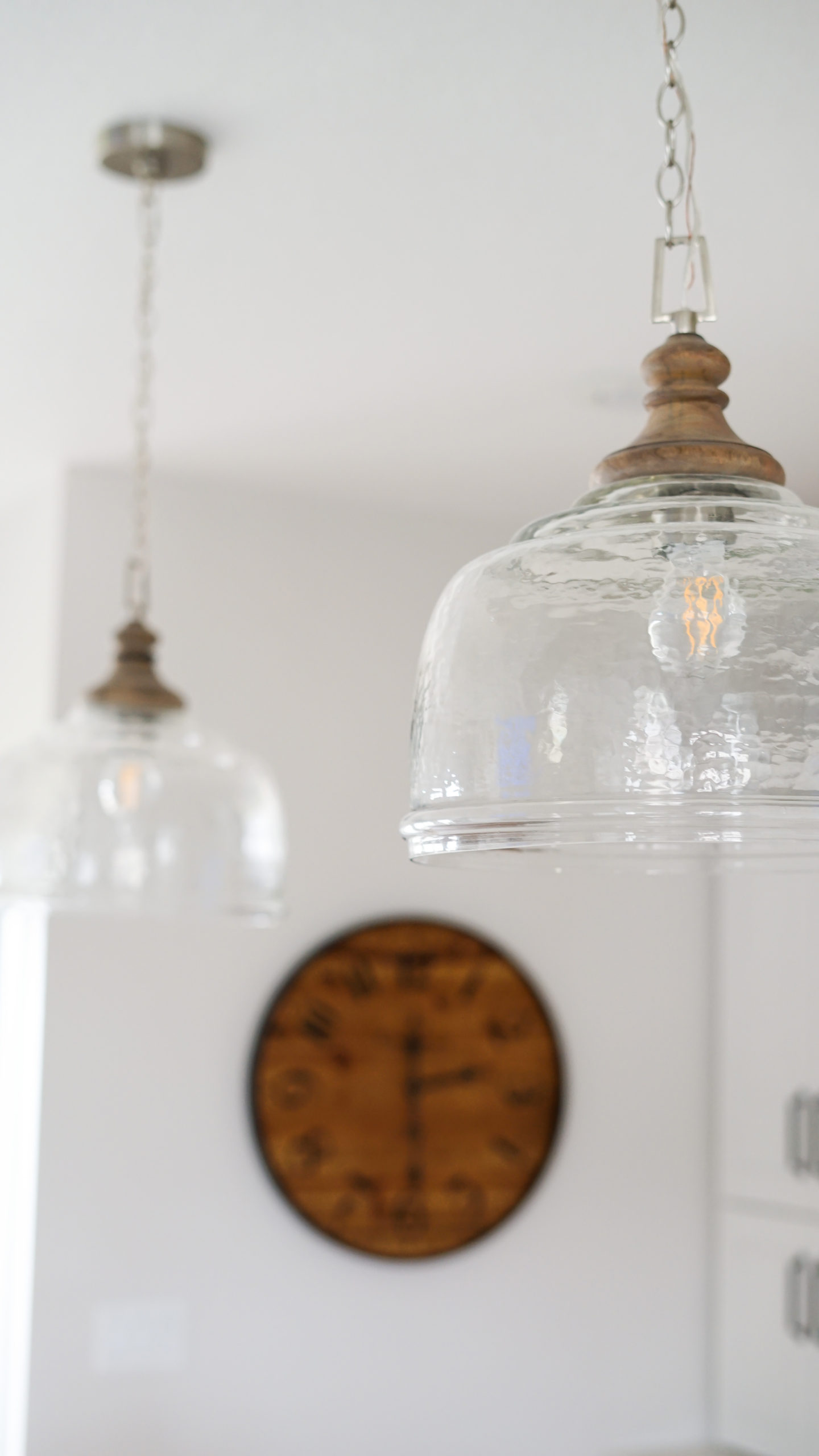
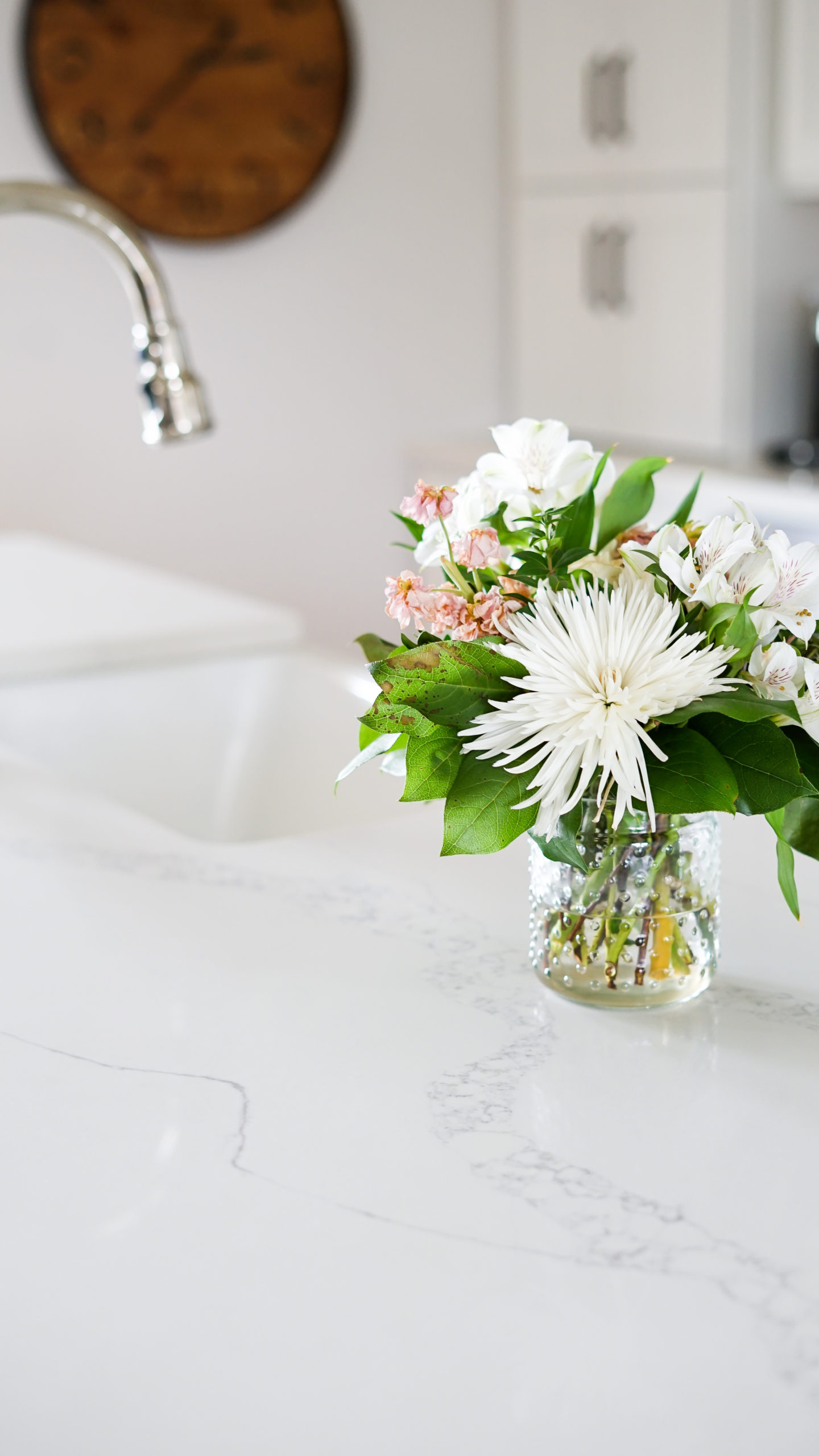
There was enough room for four stools which is great for even everyday use for our family. We chose to go with backless stools so they could tuck all the way under the quartz countertop. These gorgeous pendant lights are from the Holland House and are probably the most asked about feature when I showcase our kitchen on Instagram!
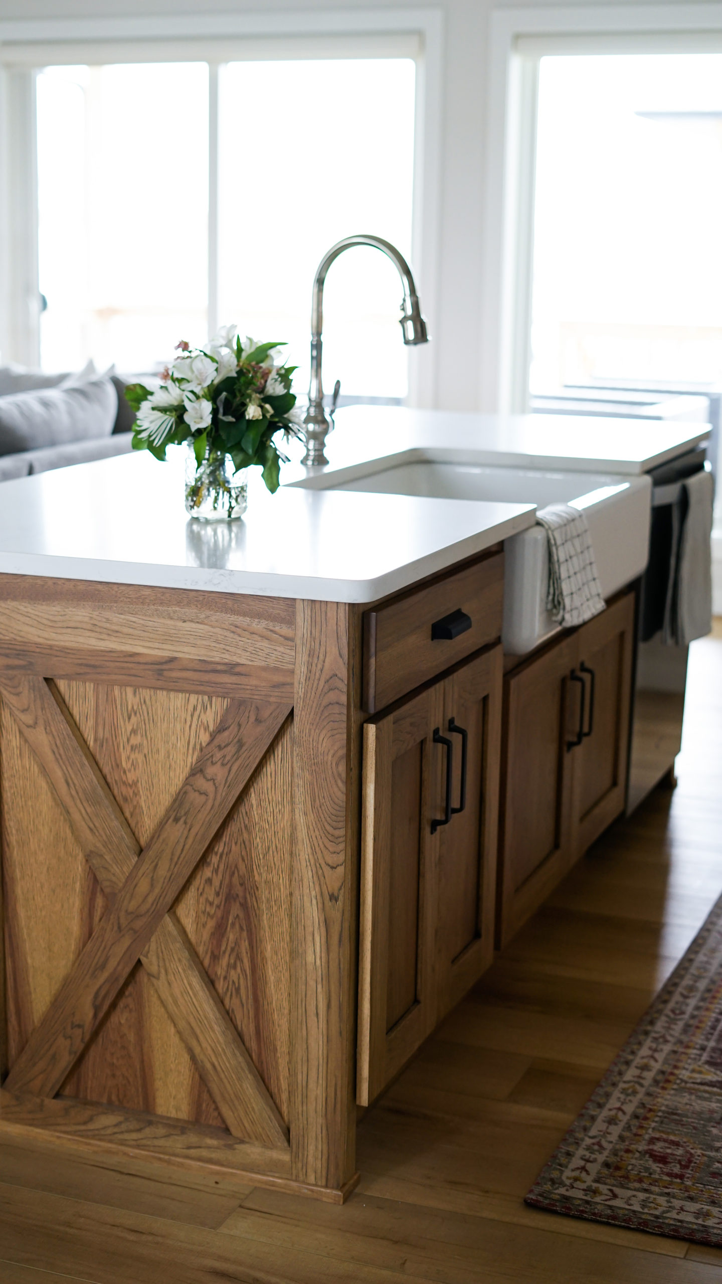
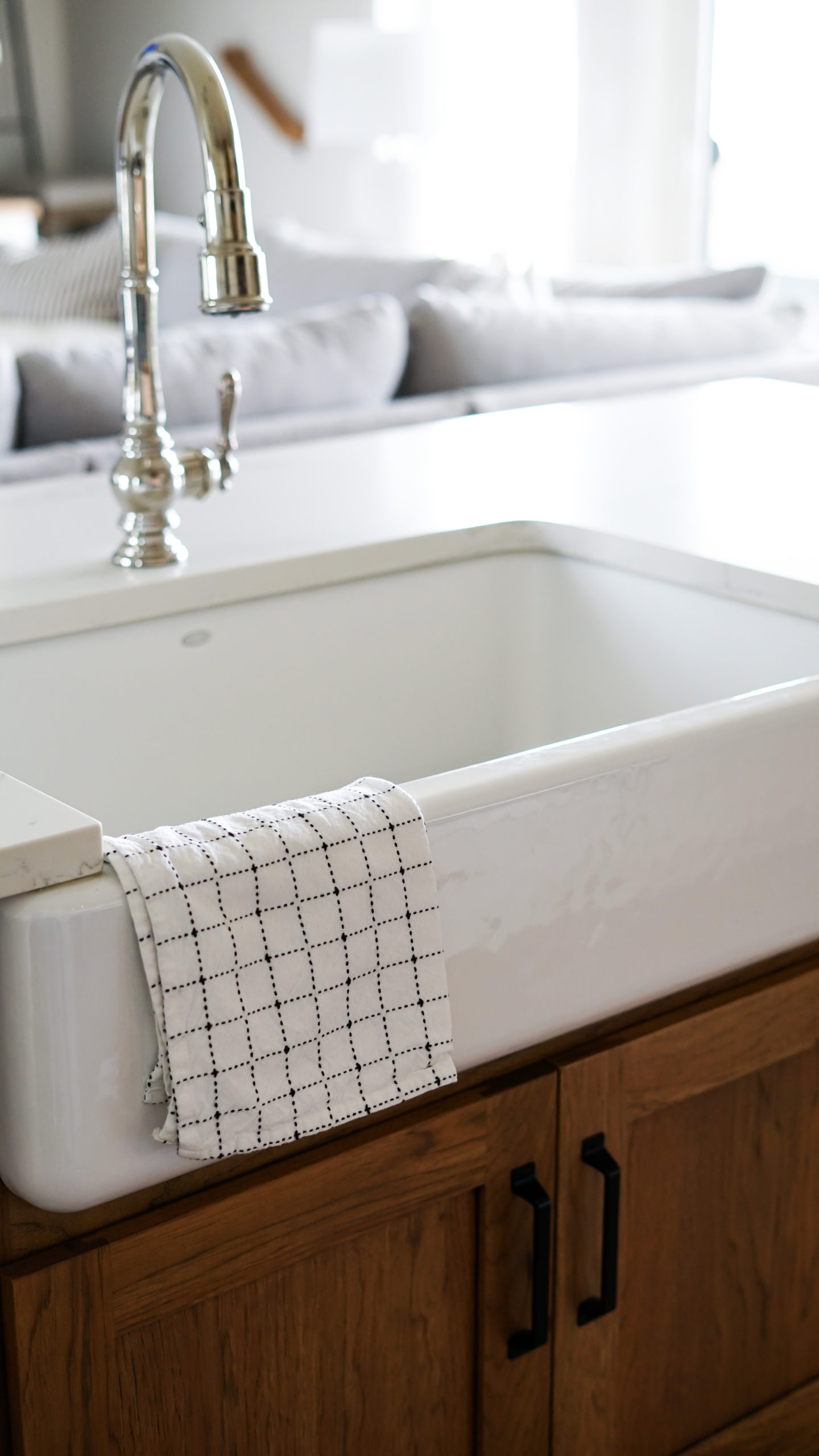
We love our deep farmhouse sink and functional, but stylish, faucet. The entire home features Kohler sinks and fixtures because we learned with our last home just how much of a difference the quality of their products can make in kitchens and bathrooms.
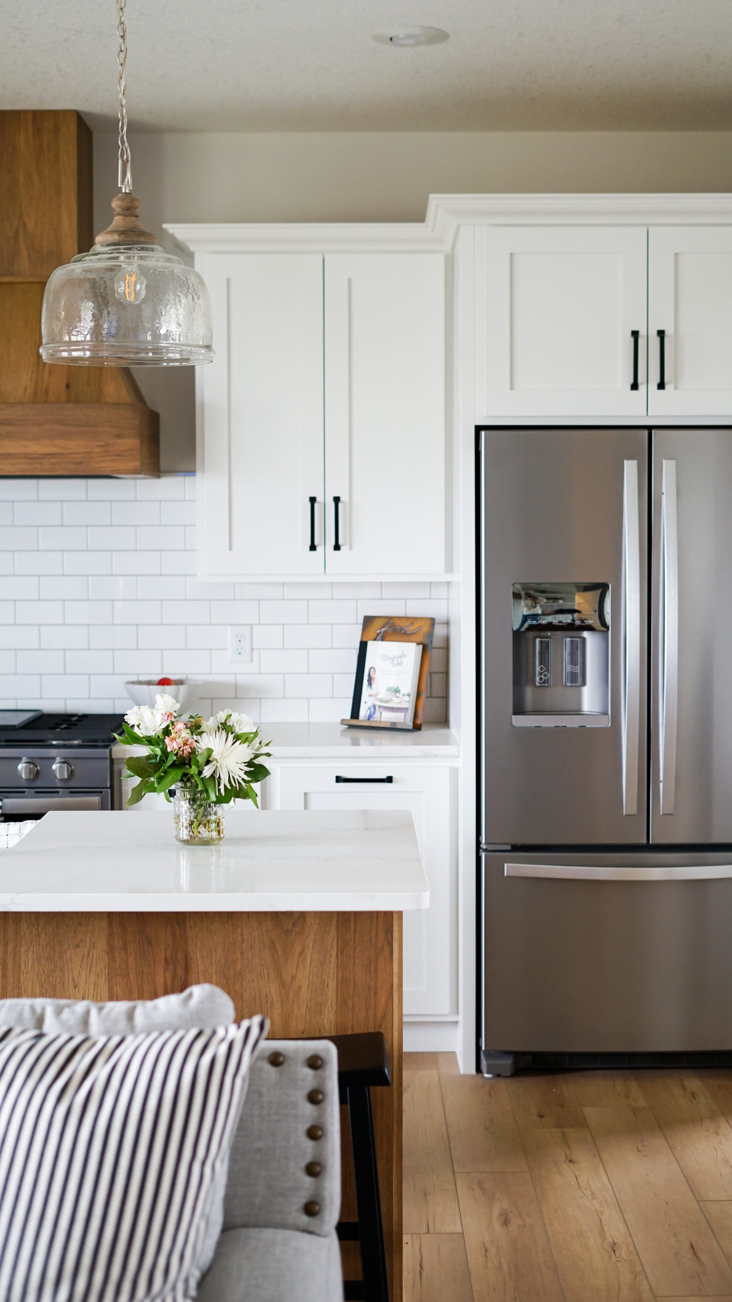
The Showplace cabinets are all shaker style doors and feature matte black hardware. We carried this theme through the entire home while mixing the two styles of drawer pulls and industrial-style handles with exposed nail heads.
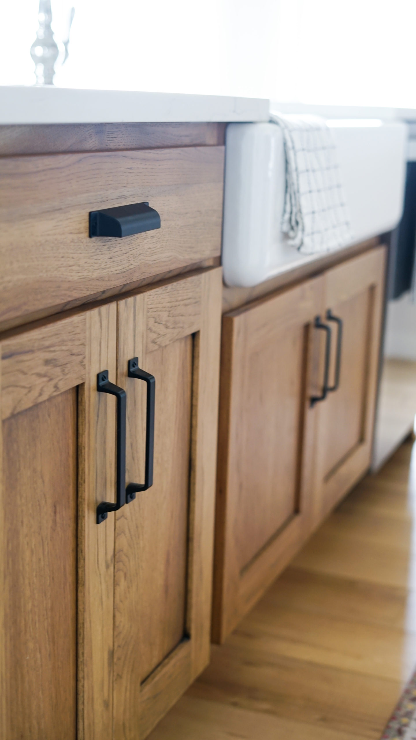
While the white cabinets for the back wall were an easy choice, we wanted to add some interest with the island color by making it look more like a piece of furniture. We chose Showplace’s hickory with a cognac stain and 10% sheen. There are a couple other places you’ll see this implemented in this home to tie it all together.
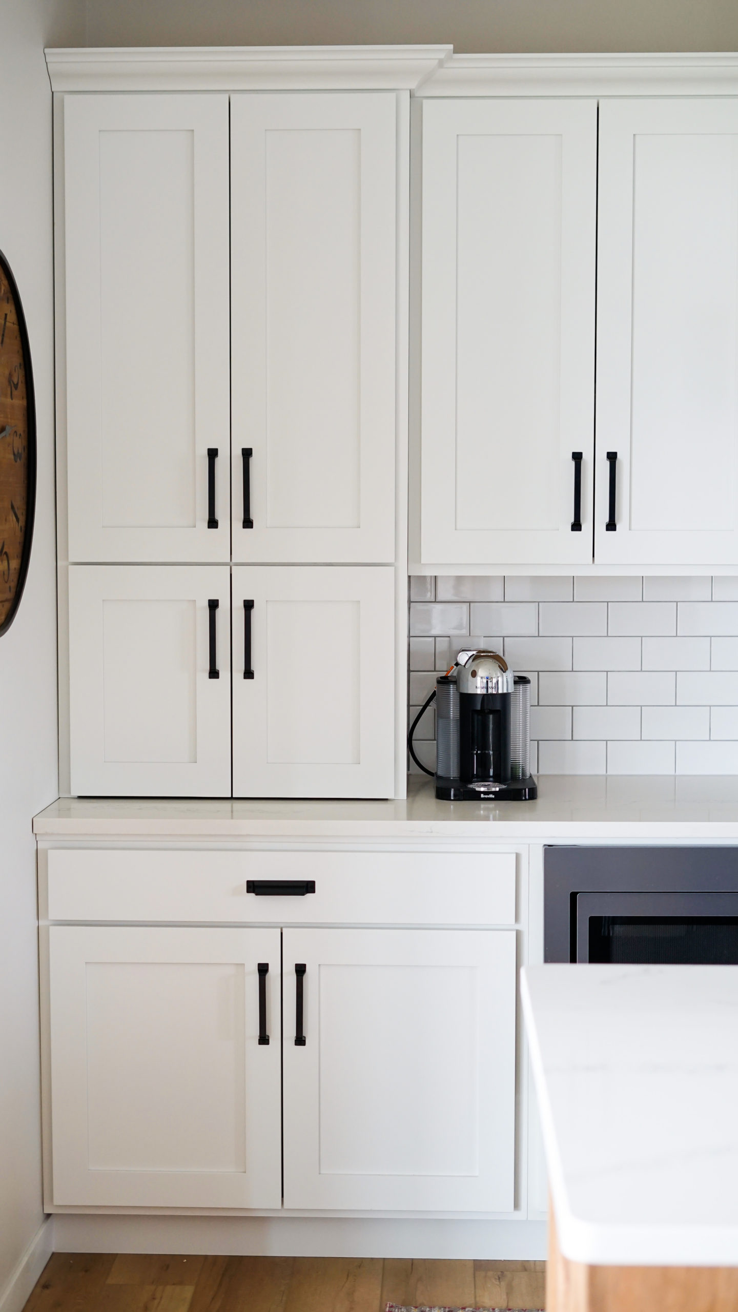
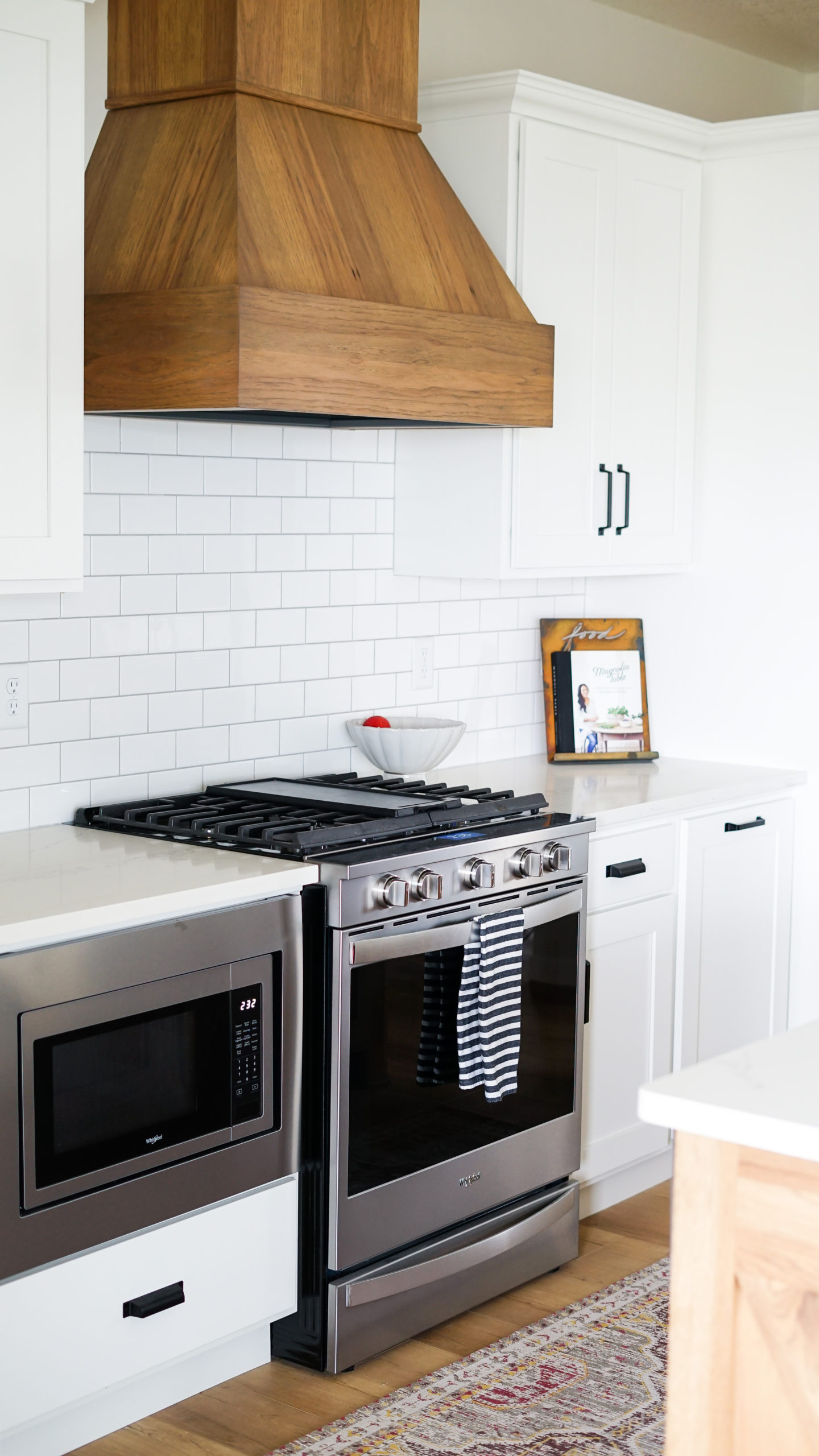
So much of our home design and placement was based on our love of symmetry. The vent hood, stained to match the island, is the perfect center piece and focal point for the kitchen. A modification we made from the original design they had mocked up was to take the left side cabinet all the way to the countertop to create an appliance garage. This not only adds to the symmetry of the space but also hides my coffee pods, milk frother and toaster.
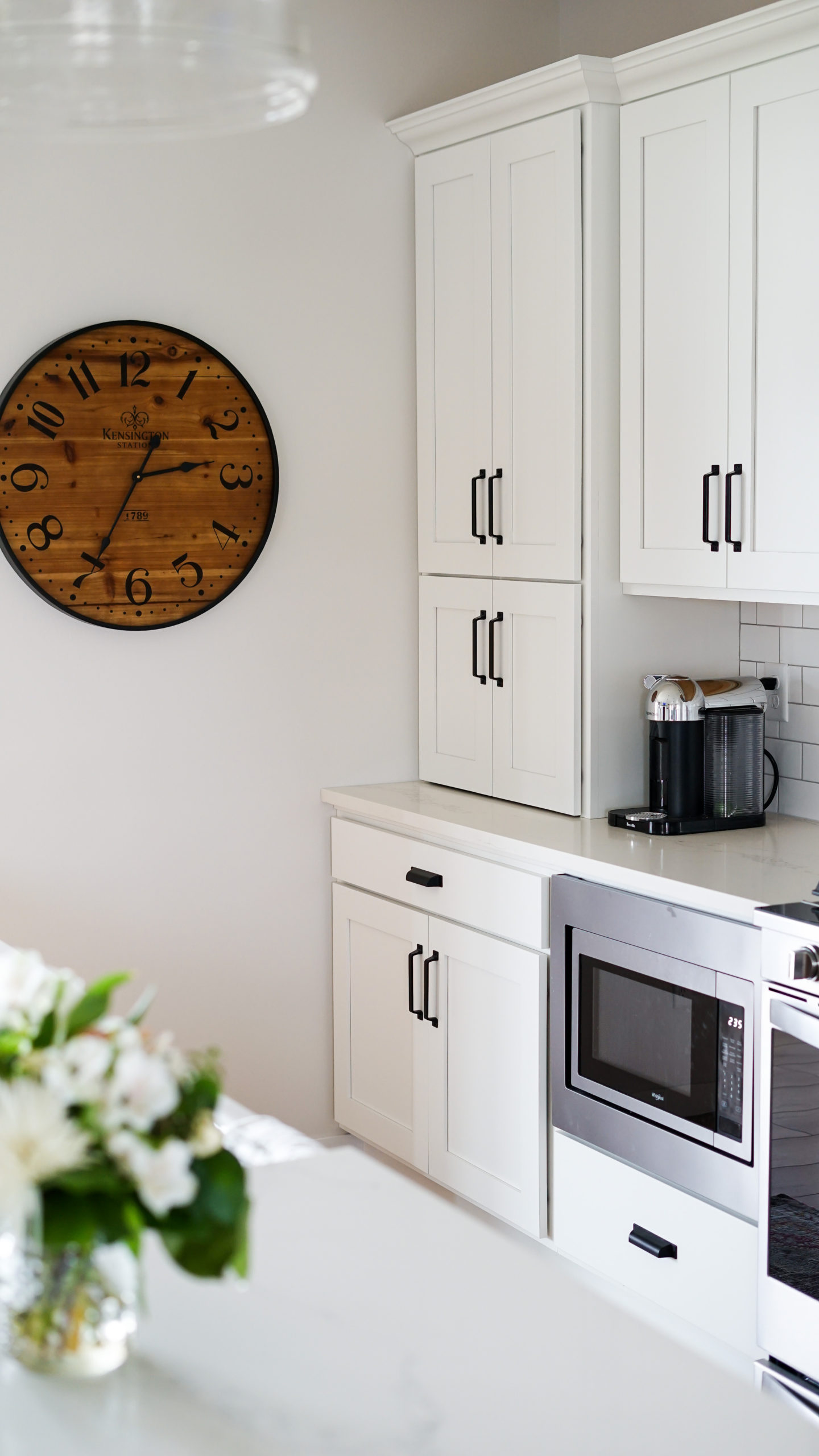
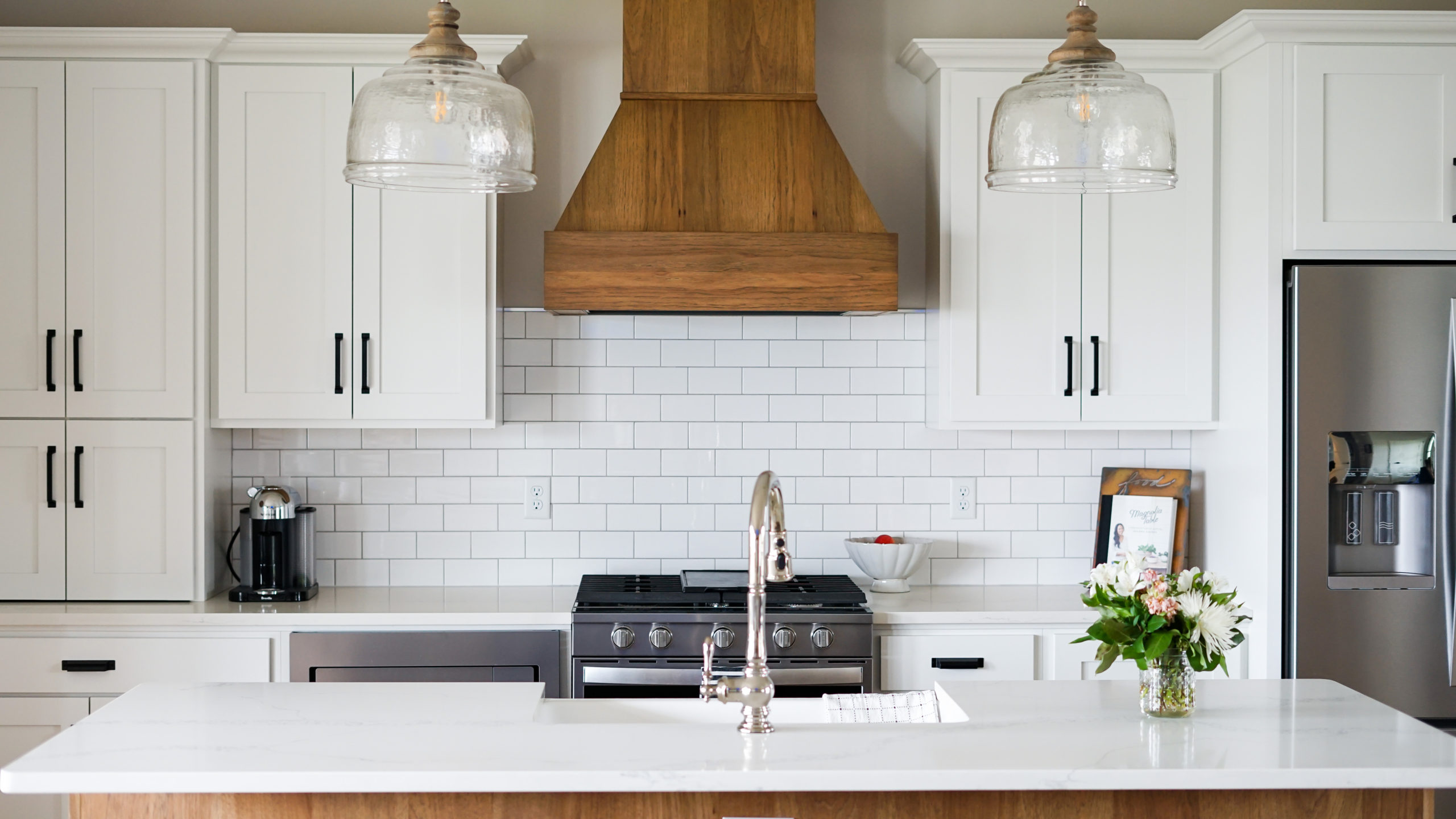
In another effort to keep the counter free of clutter, we opted to put the microwave in the lower cabinets to the left of the stove. We’re so glad we did this!
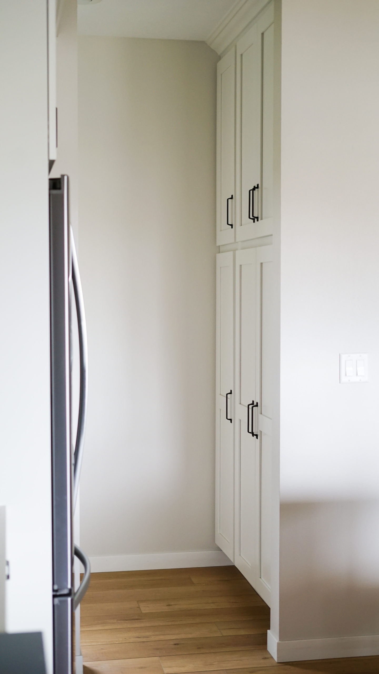
We also felt the cabinet space wasn’t quite enough for what we would need as a family of four so we added a floor-to-ceiling cabinet just off the kitchen and into the mudroom. This additional cabinet space has been perfect in serving as both a pantry and storage for things like our broom and other cleaning supplies.
I’m sure I forgot something here so in case you’re curious about something I may have forgot to mention, please leave any questions below in the comment section! I hope you’ve enjoyed reading more about the first of room of our modern farmhouse home design break-down!
xo
-M
Editor Notes:
- Wall color: Sherwin Williams “City Loft’
- Trim & cabinet color: Sherwin Williams “Pure White”
- Vent hood & island color: Showplace Cabinetry hickory with a cognac stain and 10% sheen
- Flooring: Coretec luxury vinyl plank in ‘Calypso Oak’
- Grout color: “Silverado” by TEC
- Kitchen rug: Holland House

 Reintroduction and Refresh of Midwest In Style
 Living Room Furniture Update
 Modern Farmhouse Basement Design
 Spring Shoes Under $100


Looks GORGEOUS!!!
Thanks Carrie! We love how it turned out!
xo – M
Love the wood and the white! Beautiful job on your kitchen Maren!!
Thanks Marianne!
xo – M
Beautiful kitchen 😍. What are the dimensions of your kitchen space and the island? Im remodeling my kitchen soon and this layout and cabinetry is just beautiful! I’d love to have something similar. Thank you!
Hi! Thank you so much! The kitchen is 14 ft. 10 in. long and the island is 37 inches deep and 94.5″ long.
xo
-M