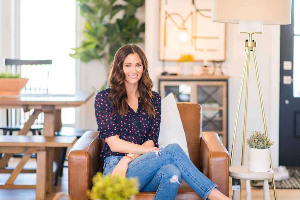
I figured we might as well wrap up the open living space since we started with the kitchen; this week is all about our living and dining rooms. They’re one in the same really which is one of my favorite parts about this entire home. There is no divide.
I mentioned early on in the building process that we were drawn to this floor plan. While open concept is appealing to most people right now, this particular design really lends itself to a flow that goes uninterrupted.
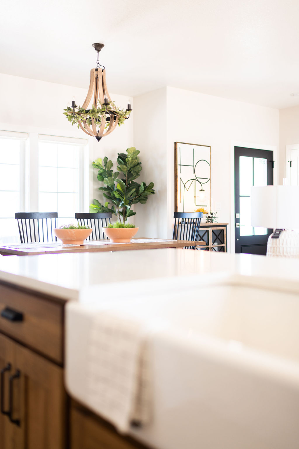
Our last home was built in the early 1930’s when house were very compartmentalized. We always knew our next house would allow for bedroom separation (more details on that coming later!) but the main living space would need to be ideal for entertaining and, honestly, family time. As anyone enters from the front door of this house, you truly get to dive right into the entirety of the home.
We eat in our dining room every day. We love that it always feels so easy to move from the kitchen to this natural wood table. We loved the bench seating we had with our last dining room table so we made sure this new table had that feature as well. The light fixture in this space may look familiar if you remember our previous home… we brought it with us from that dining room!
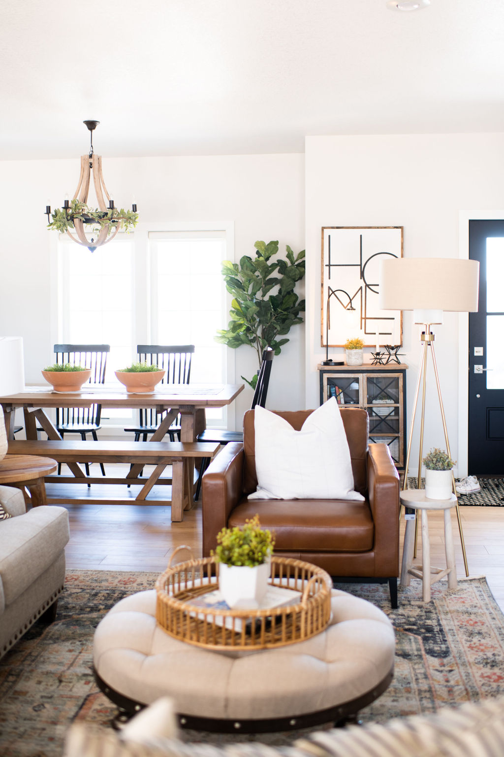
We chose not to put a rug under the table because it felt like too many rugs on top of each other. Instead, the lovely design team at the Holland House installed the subtle curtain panels. They soften the space in the absence of a rug and we love it.
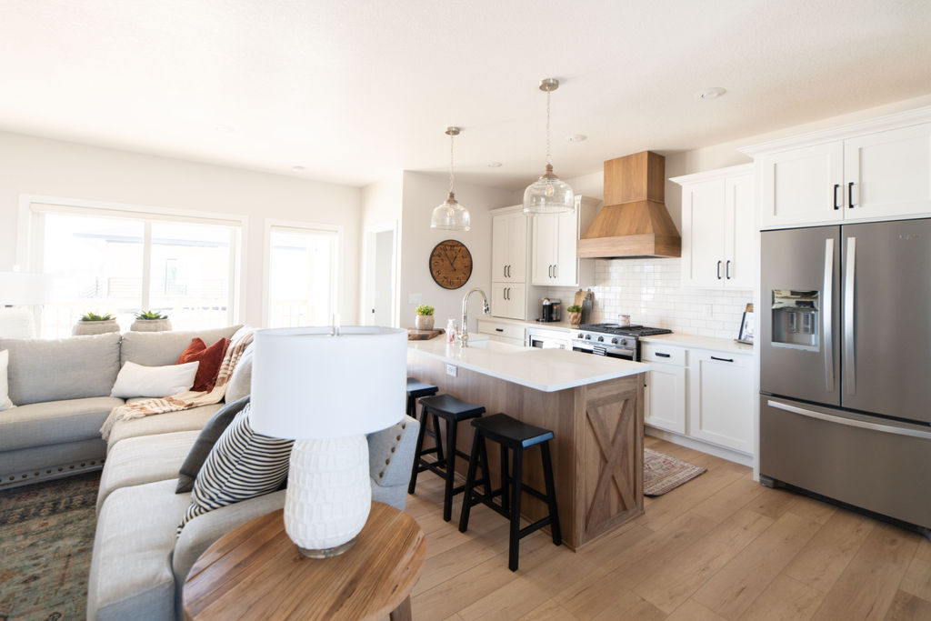
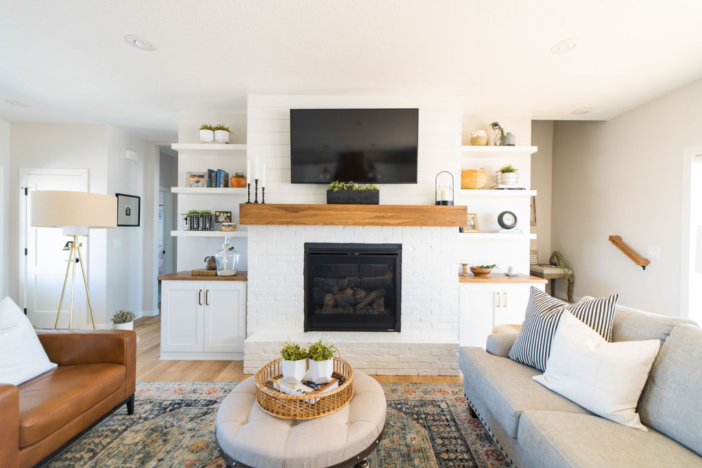
The living room, however, is grounded by the most gorgeous rug in all of the land. When we were working on furnishings, I had shared some inspiration with Marie of the Holland House. What she came up with was exactly what we were hoping for.
We labored over wall color (some of you may remember the paint-gate fiasco I shared over on my InstaStories last summer 😉 ) because we wanted it to be a creamy, off-white blend that was different enough from the white trim that it didn’t look like we’d just opted for white on white. But in the absence of much color, the living room decor makes a statement with pops of blue, red, green and brown with the rug, leather chair and shelf decor.
While we had a vision for this space, we truly owe it to the designers at the Holland House for bringing it to life.
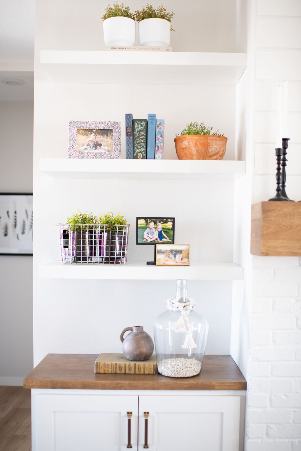
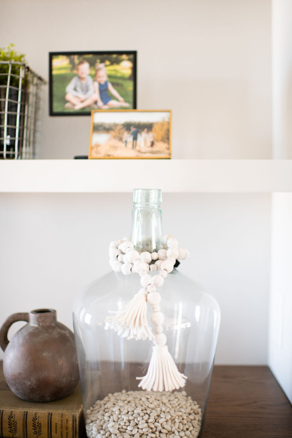
When we saw this floor plan, the main wall in the living room was already slated to feature a fireplace. But in an effort to continue the symmetry that we love and also add some storage, we added the built-in cabinets and floating shelves to the design. I’m so glad we did and it’s already been so fun to play with the look of the shelves. The built-in cabinets below have also been perfect for organizing board games, books and movies that would otherwise not have a home.
The mantel and top of the cabinets are stained to match the island and vent hood in the kitchen. We chose the gold hardware for the built-in’s to set them apart but kept the same design as the matte black handles you saw us use in the kitchen.
Next week I’m hoping to share yet another room with you all! If you have a preference of what you see next, leave your suggestion in the comment section below!
xo
-M
PRODUCT LINKS
Glass Bottle // Bamboo Tray // Striped Throw Pillows // White Pot

 Reintroduction and Refresh of Midwest In Style
 Primary Bathroom Update
 Easy Ways to Upgrade Your Home
 Dining Room Makeover


[…] that we’ve walked through the main living space, it’s time to move into the bedrooms and bathrooms! Today’s post highlights what was […]